Exhibition Text
|
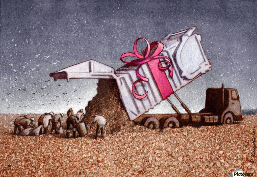
Title: Exploitation
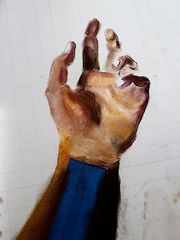
Medium: Oil pastels and chalk pastels on illustration board Date: October 2022 Size: |
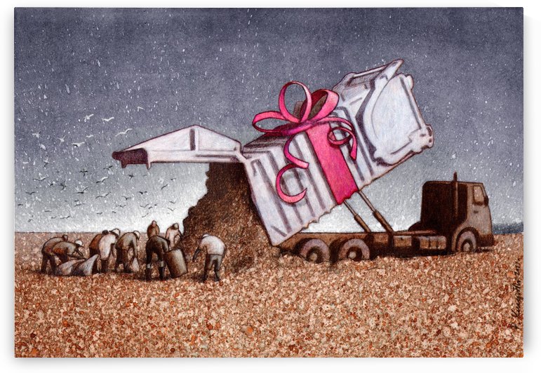
The illustration series was inspired by the satirical work of Polish artist Pawl Kuczynski. The main piece I drew inspiration from was Surprise, an illustration created to demonstrate the destruction of nature with human waste products. I, too, wanted to show deeper topics about the climate and humanity. My goal with these pieces was to showcase the way we exploit each other and the planet.
|
Inspiration
|
Pawel Kuczynski is a polish born artist, satirist and philosopher. Pawel’s artwork has been awarded over 140 different awards and commendations including the 2005 “Eryk Prize” by the Association of Polish Cartoonists. Pawel was born in 1976 in Szczecin, Poland and graduated from the University of Fine Arts in Poznań, Poland in 2001 with a degree in graphic design. Pawel’s paints and draws satirical illustrations that deal with social, cultural and political issues of modern day. Common subjects of Pawel’s illustration are social media, the Internet, mobile phones and addiction to mobile devices, and books/writing vs. electronic media. Pawel states that a big inspiration and influence for his work was Caravaggio, specifically Caravaggio’s work with light and shadow. His work holds a satirical, surrealism element it that clearly tells a story or message about a socio-political issue he cares about. They also emphasize how our society functions in a modern globalized manner.
|
I first saw Pawel's work on Pinterest a couple of years ago, and was immediately attracted to the connection to modern issues. I personally believe that art, especially, should include social commentary. The fact that he had hundreds of illustrations each detailing a flawed part of our world really inspired me and made me think about my role in these issues. I love art that causes reflection on the function of things we often gloss over or don't think deeply on, and I wanted to incorporate that into my own work.
|
The background of Surprise is relatively simple, with some gradient in blue and white so it isn't flat. Their is balance in the piece in the mostly symmetrical vertical sides and an equal weight between the sky and the trash-covered ground (though its split to about 1/3). The muted tones create a dim and gloomy mood, devoid of things bright and alive. Except, of course, for the ribbon tied around the garbage truck. Even that feels dull due to its pinkish hue. There is movement travelling diagonally from the top right to the bottom left, following the white metal down to the workers. There is the action of the trash falling out, which further supports the flow of the piece. The base of the truck draw attention back to the right side, then up again to complete the triangular movement. Surprise demonstrates the awful ways in which human consumption has caused an increase in waste and has decimated the planet we call home. The ground is littered with small, colored scraps of trash and the satirical element of the bow on the garbage truck becomes a further criticism of our treatment of the environment.
|
Planning and Experimentation
|
After I had completed my research on my artist, I got to work by purchasing a small set of oil pastels. Thankfully, my father already had a large amount of chalk pastels at home that I could use. The purpose for using the two different mediums was so that I could experiment and essentially kill two birds with one stone, as I have never used chalk pastels and I haven't done any real study on oil pastels before. I thought it would be a good opportunity to try new things while keeping them similar for the project.
|
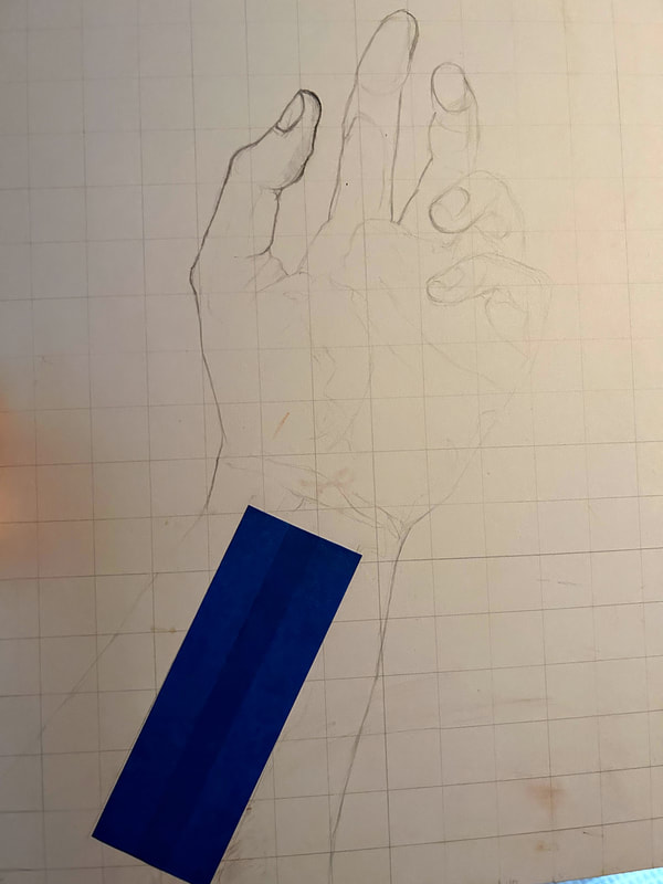
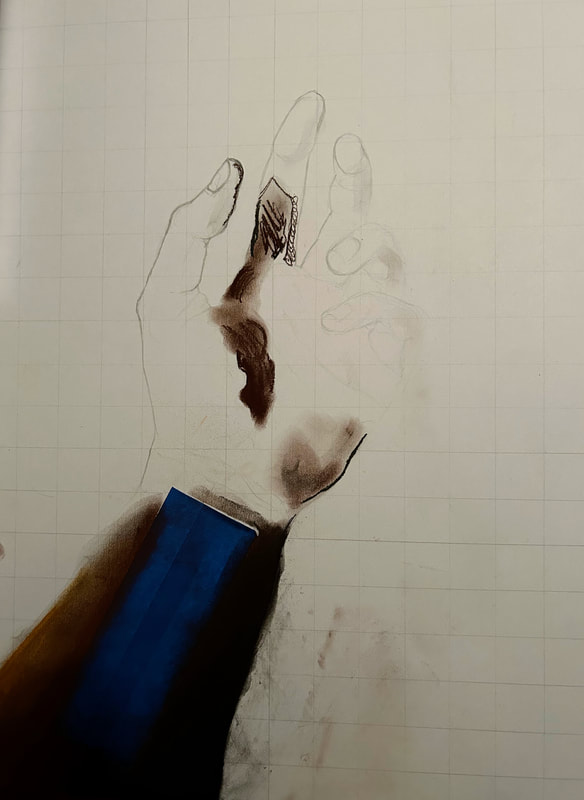
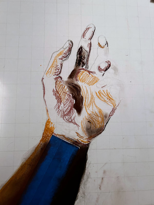
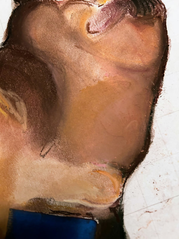
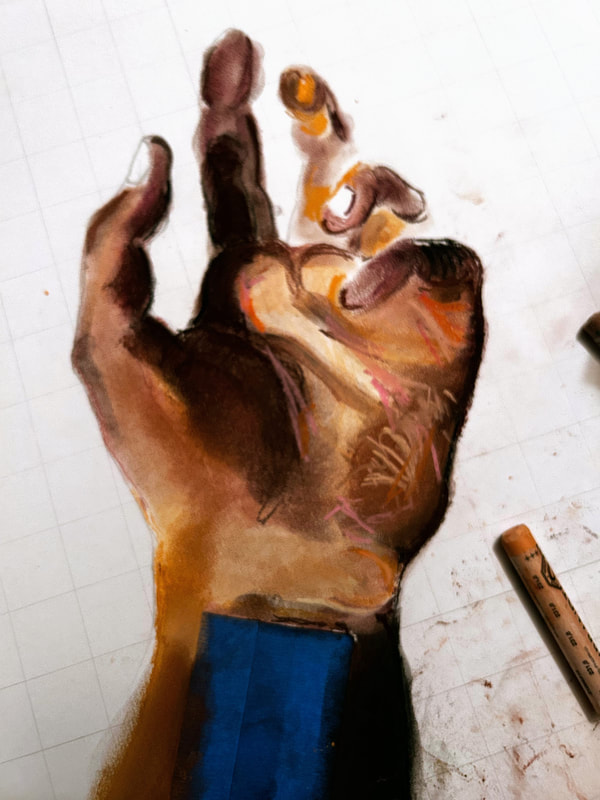
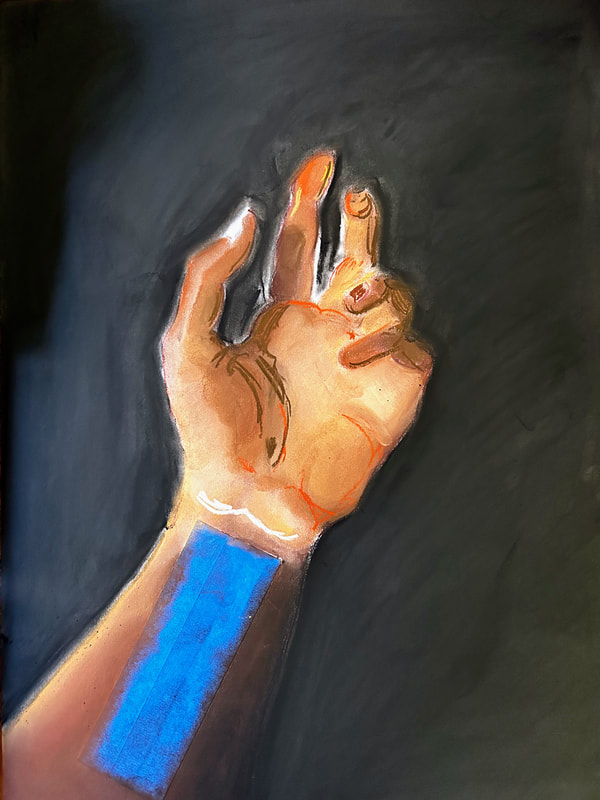
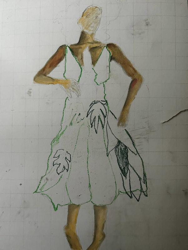
.During my experimentation, I wanted to focus primarily on the things I would need for my subjects. For the oil pastel illustration, this included a lot of greens and plant matter, which I worked on until I was satisfied with the results. For the chalk pastel, this included figuring out skin tones and layering with different browns. I also included some light sketches, one with color, to figure out how exactly my idea would lay out. For the chalk pastel, it would be a hand, partially open, displaying a row of barcodes on the inside of the forearm/wrist. This would help portray the exploitation of migrant workers in the U.S., as they are seen as an economic entity. There is a lack of humane treatment of people who work at the foundation of our country, so I wanted to display the way that they lose their individuality and humanity in the eyes of big corporations. The oil pastel portrait would emphasize how horribly we have treated our planet and the devastation we have caused for our own greed. A woman, representing Mother Earth, has been split open and is losing her life. She is dressed in green leaves, hence the subject of my experimentation. i was inspired for her design during the summer, where a tiktok was created to demonstrate the emotional hurt caused by the overturning of Roe. V. Wade. (For more on that subject, visit Firetrucks Don't Stop at Red Lights or Control .
|
Process
Exploitation #1
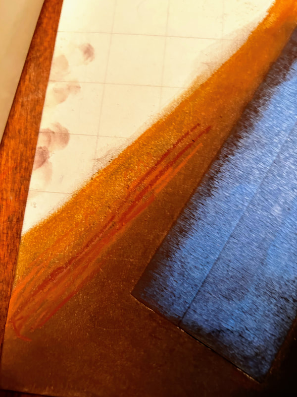
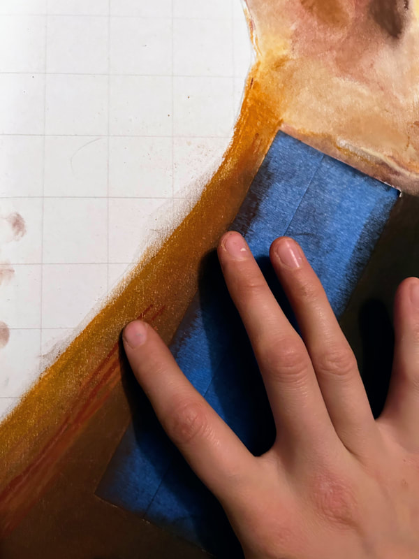
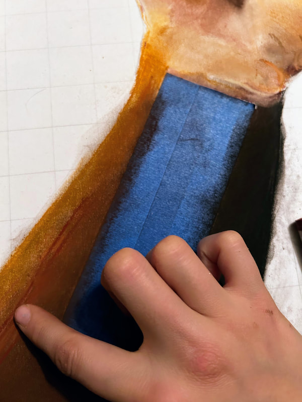
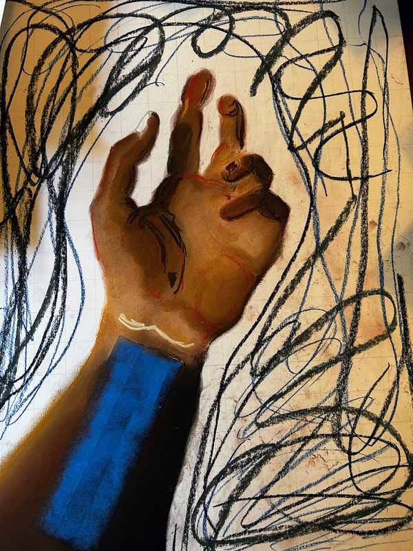
The process of the first piece was somewhat experimental, as this was my first official drawing using the chalk pastels. The first thing I did was print up my reference photo and draw the grid over it, then copy it onto the larger illustration board. Once I had the outline and shadows done, I taped on some pieces of masking tape to preserve the integrity of the area for the lines. I didn't want the messiness of the pastels to affect how well I could use the other mediums on it. It was placed at the center of the wrist as much as I could. I then began with the darkest areas of skin, using long, light strokes to get the base colors on. I blended using my finger and slowly began adding layers and building up lighter colors towards the left side of the wrist. I added some more dark brown in the shadowy area of the palm and thumb crease. Once again, I began slowly adding more and more colors to help fill out the hand and add depth to its appearance. This meant adding different shades of browns, grays, pinks, tans, and more to help develop are more realistic vision of human flesh.

|
|
|
|
|
After blending, I would continue to add more until it began to match the reference photo. I began with trying to finish off the writs and forearm area before continuing on with the palm and fingers. Once I was satisfied with the appearance of the bottom half, I turned my attention back to the top of the subject. It was here that I experienced the most difficulty. After a few minutes, my guidelines had all but disappeared and the values I thought that the hands were refused to match what I was wanting. I tried added more light, then more dark, then light again until I decided to change directions. I thought that perhaps adding a background would help with getting the rest of the drawing. Since my inspiration has some more blank backgrounds, and I didn't want it to distract from the piece, I added an assortment of dark blues, grays, and blacks both to help mimic the shadow in the reference and provide more pop and contrast to the drawing. I continued in layers and blended them together in a circular direction around the hand to add texture and a hint of movement. I think it really helped to establish a base.

|
|
|
|
I also really started to struggle in getting smaller details and fine lines due to the nature of the medium. It didn't hold very well, and, since I wasn't finished, I couldn't put a protective spray over it to keep from smearing. I kept going, just adding layers and depth while maintaining its original form as best as I could. I found this quite difficult and I grew very frustrated. However, I knew I had to keep going, so I reset myself and got back to work. I knew it wouldn't be hyper-realistic, because of how messy chalk pastels are, but I figured that making sure it had a likeness to what I was trying to portray would be my goal.
|
|
|
Once I was satisfied with the appearance of the hand and the background, I sprayed it with a fixative spray, then carefully peeled the tape back. I then used a small blade to cut the tape horizontally and placing them intermittently on the wrist. Then, using a black pastel, I colored in-between the strips of tape and then sprayed another layer on that section. Lastly, I took the rest of the tape off and considered it complete.
Exploitation #2
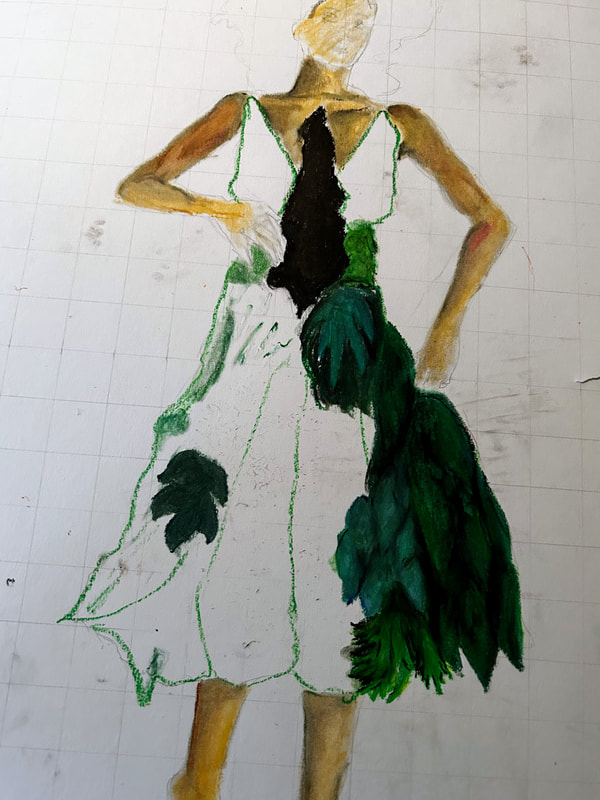
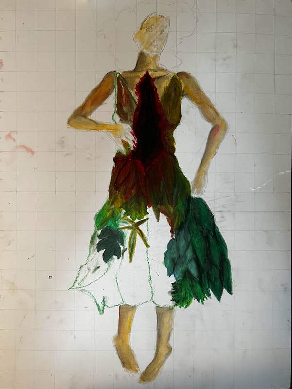
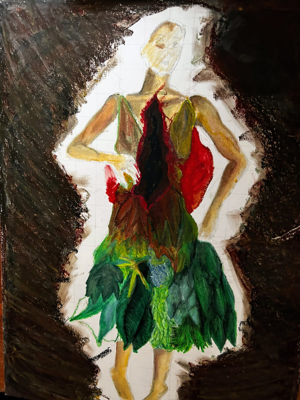
The next step on the second drawing was to begin coloring it in. I began with a base tan color and slowly added more layers, including grays, browns, and reds, to help create a more realistic skin. I blended the colors with a q-tip, and simply continued to build up until I had a good-enough start on the flesh parts of her body. Next, I began working on the dress. I began, again, with shades of green and changed them to create depth and shape. I added blacks and dark greens for areas of shadow and whites, yellows, and light greens for areas of light. I mixed in blues or yellows on different leaves to create the effect of different species of plant, as well as different shapes and textures. This helped to bring life to it, in my opinion. Closer to the cavern in her torso, the leaves turned brown and red to symbolize that they were dying, similar to the fall season.
|
The second piece in the diptych is focused on environmental exploitation and unsustainable practices that have caused massive amounts of damage to the planet. I began by creating a grid, then transferring a screenshot from the tiktok onto paper and placing a grid over it as well. I transferred the drawing in pencil onto the illustration board.
|


NOnce most of the basic details on the dress were done, I began filling out the background. I wanted it to be a sloppy mix of colors, but also darker than the subject so that it would match the first piece. Also, I wanted to maintain the earth-like theme, so I settled on a mix of grays, browns, black, and tan, layering them on top of one another and then blending with my fingers. Next, I completed coloring her skin and hair. Once that was done, I worked on adding small details and making adjustments, such as her facial features, last-minute shading and highlights, and the like before I felt it was finished.
|
|
Critique
|
My works are both vertically oriented, with central figures. Both pieces have darker backgrounds, compared to a full setting in Pawel's work. There is distinct movement in Pawel's piece in the form of a triangle, whilst my works contain almost no movement besides a simple up and down direction. Appearance-wise, there are no similarities between my work and Surprise-they are entirely different subjects, with a different style of drawing and medium. Pawel's work also feels lighter, whereas mine feel very heavy. Whether this is due to the dark backgrounds or the medium, I am not sure. The space feels more filled out in Pawel's work as well-both the foreground and background are part of the image. However, they share the same purpose and overall motivation for creation.
Reflection
I feel like my two pieces definitely connect to the inspiration in purpose and meaning, though they are slightly different issues and different representations. I hope that this provokes viewers into thinking more deeply in how people and the earth are exploited, and the consequences of such treatment. I don't know if it conveys the way I want it to, and looking back, I'm not entirely happy with the designs. Furthermore, I didn't really enjoy working with pastel. It was messy and felt blocky, which made fine details hard. I like adding lots of small details, which felt impossible with both types of pastels. I did like the oil pastels better because they held their weight and layers better than the chalk pastels. I feel like this project wasn't successful and an accurate representation of my drawing ability, and I feel kind of embarrassed and ashamed of them overall. I really hated the mess the pastels made in my work area, other parts of the board, and my hands. At the very least, I got experience with two mediums I haven't used before seriously, and can confidently say that I don't like the idea of using them for future projects this year.
