Growing Up
|
|
|
|
|
|
Title: Growing Up
Size: 12" by 24" Materials: Canvas, Oil Paint Date: November 2021 |
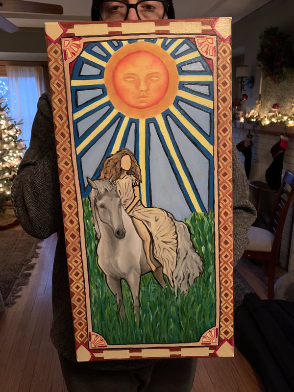
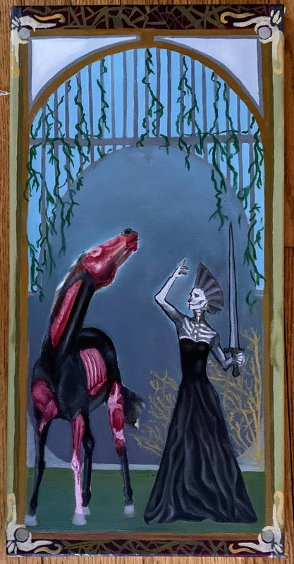
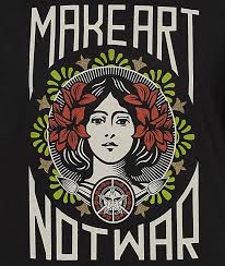
Exhibition TextGrowing Up is a diptych painting made with oil on canvas, which I built myself with frames, canvas sheet, and staples. The two canvases reflect different sides of a story-one at the beginning, one at the end, meant to represent the loss of innocence through life. The inspiration for the duo was Alphonse Mucha and his distinctive style, which was most notable for its graphic quality and designs. Throughout the paintings, I attempted to add in his influence in his use of borders and subject matter. Furthermore, I drew inspiration from the traditional Tarot cards, most notably The Sun and it's composition.
|
|
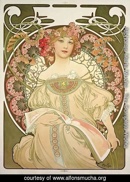
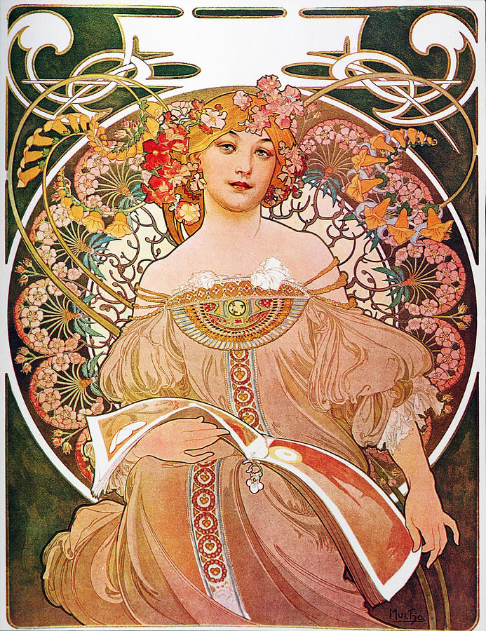
The artist who I found inspiration from for this piece was Alphonse Maria Mucha. Born in 1860 and living until 1939, Mucha was a Czech Art Nouveau artist known for his various paintings, illustrations, advertisements, and designs. Mucha's style was characterized mostly by his portrayal of young, beautiful women dressed in flowing dresses that were vaguely reminiscent of earlier Neoclassical styles. Often, they were surrounded by flowers and other natural elements, which helped form borders and halos around them. His compositions commonly depicted these heavily stylized floral patterns and silky, swirling hair and clothing with a flat, graphic quality. This made him popular for posters and illustrations. In fact, his style was so unique that it was dubbed "Mucha style" by Parisians before it became Art Nouveau. The reason that I have taken inspiration from this amazing artist is for a more personal reason- my father. An artist himself, one of his favorite artists is Alphonse Mucha, and we have many copies of his work throughout our house. This includes Four Seasons (1896), F Champenois Imprimeur Editeur (1897), Chocolat Ideal (1897), Waverley Cycles (1898) Cognac Bisquit (1899), a few others, and a series of coasters depicting various Mucha works.
F Champenois Imprimeur Editeur (1897)
|
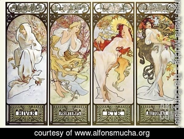
Four Seasons (Mucha, 1896)

Waverley Cycles (Mucha, 1896)
Growing up around these pieces was something I didn't really think about until I took Art History sophomore year, when when I learned about Art Nouveau and Mucha was an artist we talked about. After hearing that we were supposed to paint a dip/triptych, my mind immediately went to the works of Alphonse Mucha and I knew I wanted to stylize my piece like him. The ways that I planned to reference Mucha were in his use of soft blending and outlined figures in flowing garbs, as well as his use of borders and intricate patterns. Mucha's work often has a flat quality with multiple layers atop one another to create the 2-D feeling. However, the central figure is usually blended quiet smoothly and realistically, giving the appearance of unblemished, creamy skin.
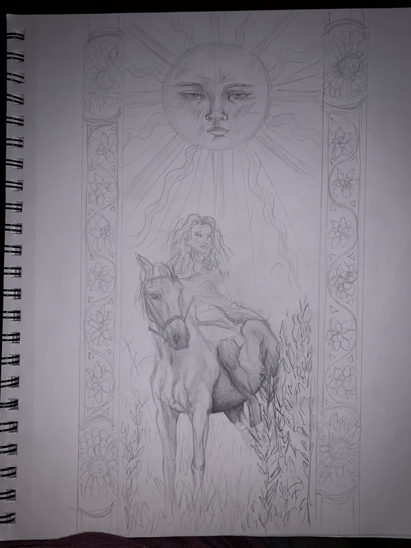
The second part of my inspiration comes from tarot cards, which are traditionally used to read people and/or tell fortunes. They have a long history and have evolved into full decks over time. My sister is interested in many spiritual outlets, tarot being one of them. With the idea of keeping my inspirations close to home, as Mucha was, I decided to include the designs and meanings of some tarot cards in my paintings. Their layout somewhat reminded my of Mucha's work, and I decided to combine the two to inspire my assignment.
|
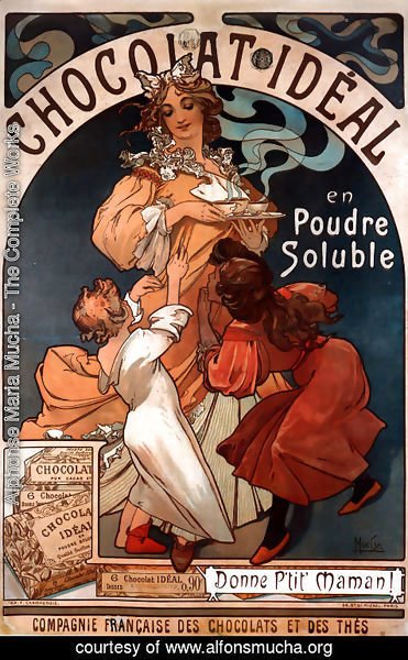
Chocolat Ideal (Mucha, 1897)
Cognac Bisquit (Mucha,1899)
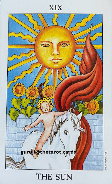
The Sun (Tarot Card)
|
|
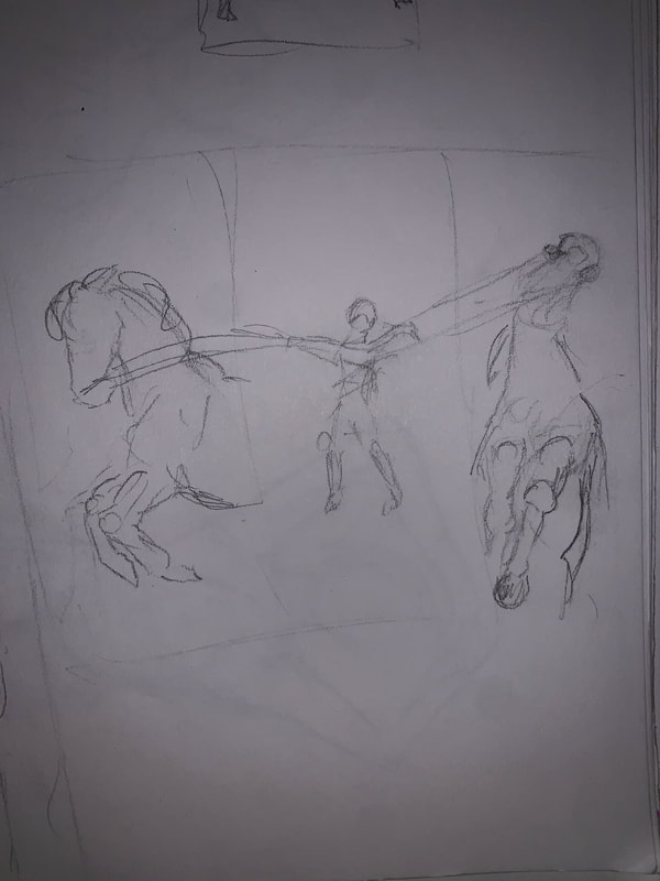
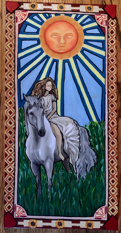
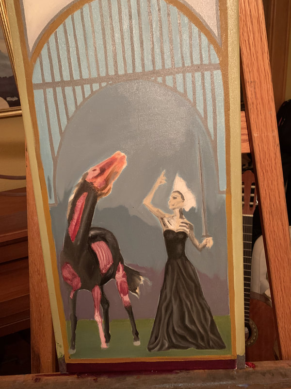
Once I had inspirations and a light idea of what I wanted my paintings to look like, I decided that I wanted to challenge myself by experimenting with oil paint (instead of the other option of acrylic). I also had to plan out how many paintings I wanted to do, since the prompt was to create either a diptych or triptych. Wanting to up the challenge, I made the decision to create a triptych. That way, I could really flesh out the story and message of my piece. I began sketching, fleshing out ideas onto something physical. One of the first storylines and designs had to do with the concept of trauma and healing, going along the lines of a before, during, and after. However, I was also tempted to create something where each figure was the same, with different characteristics that differentiated them. I was inspired by an idea my teacher said during one of our lectures about someone's chest being opened up to reveal flowers. Anytime anything that could be considered dark, arcane, or unsettling strongly interests me, and I thought that I could make one figure with flowers, another with regular flesh, and another with cybernetic material. However, I was not happy with the designs that I produced, and I decided that it would be better for another project. Moving that to the side, I started going back through my inspirations to find, well, inspiration. I settled on one tarot card in particular: The Sun. It depicts a young child riding a white horse under the rays of a sun, which looks ahead. The messages are associated with innocence, purity, and happiness, and I latched onto that. I studied the meanings and symbolism in all of my sister's tarot card deck, cross-referencing and checking across multiple platforms to make sure my information was as accurate as possible. I drew out some ideas, taking aspects from the tarot card and Mucha's works, and came up with a rough sketch. Happy with it, I decided to go all-out on that idea and designed the second and third panels. While I was designing them, I kept my influences in mind to ensure that it was obvious what I was taking my inspiration from. Also, I wanted to make sure that these pieces reflected each other in one way or another, so I tried to keep the layout and positioning as similar as I could while still including differences to show the evolution of the story.
|
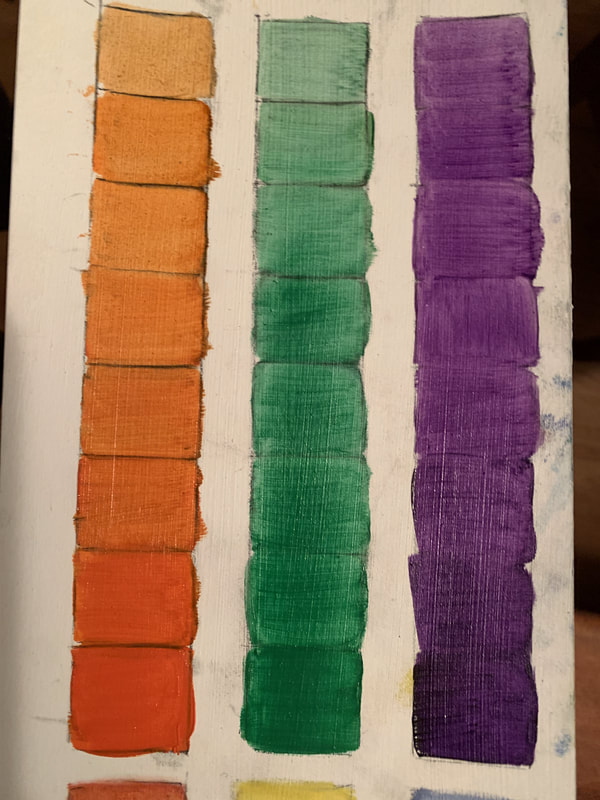
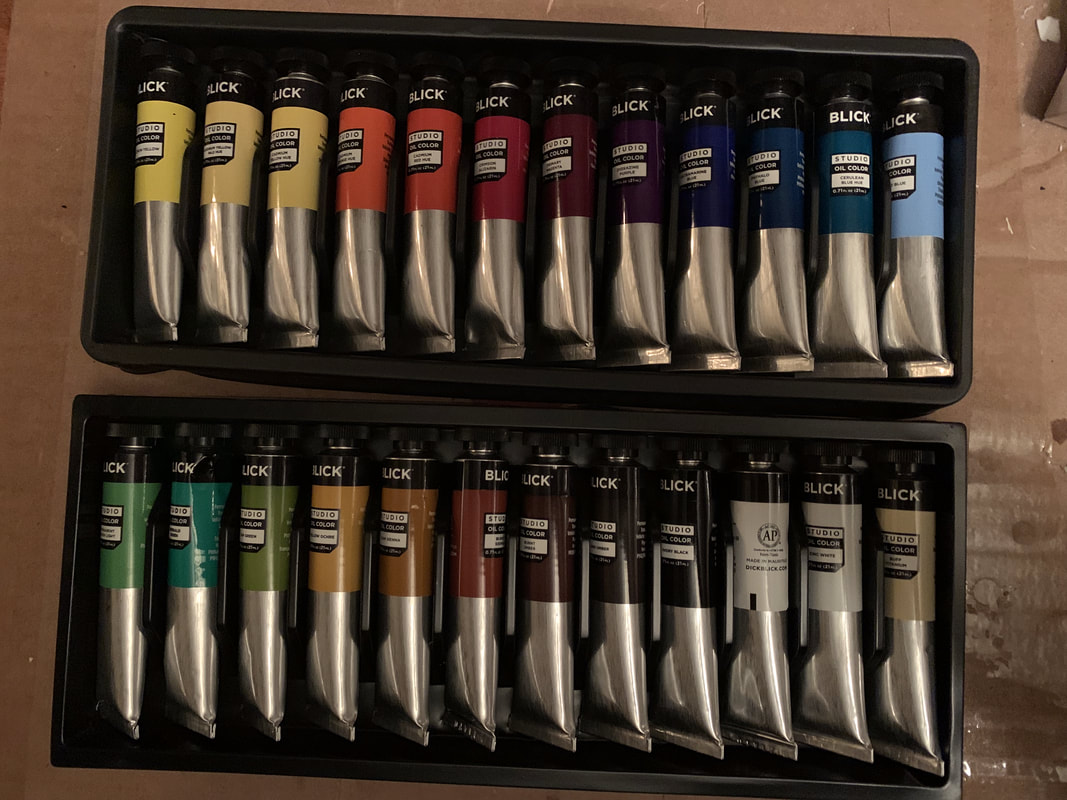
The next step was to begin my painting experimentation. I went out and got a good deal on a set of oil paints, since I wanted to continue to experiment even after this project was done. I also bought turpentine, linseed oil and new brushes. I searched up a few tutorials on YouTube and asked my dad about some specifics (since he went to MIAD and is an artist himself). With all my supplies ready, I painted a quick coat of gesso on some watercolor paper and began experimenting. I painted gradient scales, color blending, different brush strokes and brushes, and tried to become more familiar with the medium as a whole. I also tried to create skin tones with select colors (using only white, yellow, red, and blue) and experimented with creating new colors. I practiced some color theory as well.
|
|
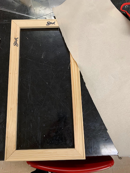
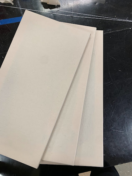
The first step in my process was to create the canvases I needed. After observing a demonstration, I put together three canvases using the following steps:
-Putting together two 24 inch pieces with two 12 inch pieces and using a staple gun to ensure they were stable and connected -Cutting out a slice of canvas slightly larger than the frame and laying it overtop -Folding a corner and top side of the material, making sure it was tight, and stapling it -Repeating with each side and corner, pulling hard to make sure the surface wasn't too loose Painting the front and sides of the canvas with gesso twice to secure a tight, bouncy canvas for success later on |
|
|
The next step was to begin my painting experimentation. I went out and got a good deal on a set of oil paints, since I wanted to continue to experiment even after this project was done. I also bought turpentine, linseed oil and new brushes to use specifically for oil. I searched up a few tutorials on YouTube and asked my dad about some specifics (since he went to MIAD and is an artist himself). With all my supplies ready, I painted a quick coat of gesso on some watercolor paper and began experimenting. I painted gradient scales, color blending, different brush strokes and brushes, and tried to become more familiar with the medium as a whole. I also tried to create skin tones with select colors (using only white, yellow, red, and blue) and experimented with creating new colors. I practiced some color theory as well. (Continue Below)
Experimentation Phase
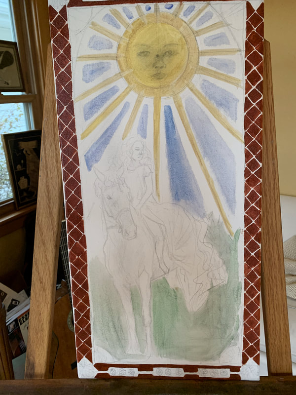
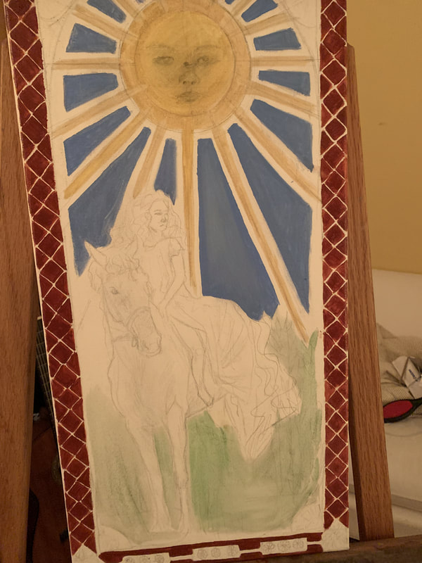
The next step in my process was to being painting. I started with the "first" one (the start of the story) by painting a wash of some of the underlying coats. This was to establish a base and to map out the colors of the piece. I wanted this one to be bright, vibrant, and warm in feeling. The border was darker in color, with a maroon shade, that I crisscrossed to make a pattern. I also painted a light wash of blue for the sky, green for the plant matter, and yellow for the sun. Since the horse and dress were going to be white, I kept it blank at first. I then added more white to the blue parts and shades of light yellow, gold, and orange to the sun. I tried to create smooth shading for the sun, taking advantage of the oil paint's properties to create a creamy texture. Once again, my goal (with the sun in particular) was to create warm tones to represent the heat and light of the giant star.
First Stages (wash and border)
Final Stages (finishing details and borders)
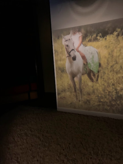
Photo References
|
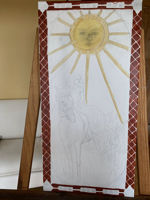
The next step in my process was to trace my reference onto my canvas. I opted against grid method on the account of not wanting to have to convert anything. However, I had to create a proper reference through Photoshop. I combined a photo of a young girl in a white dress and a white horse in a grassy field, using the skills from my previous project (Left or Right) to make a reference that suited my needs. Once I had printed out a picture of the edited photo, I used a projector to trace the image onto the first canvas. For my second painting, I used a slightly different method, skipping out on the Photoshop and instead finding two different images and tracing them separately. Overall, the two paintings looked complex enough to demonstrate my intentions.
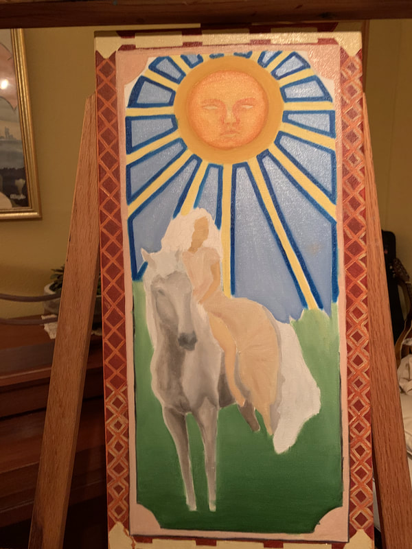
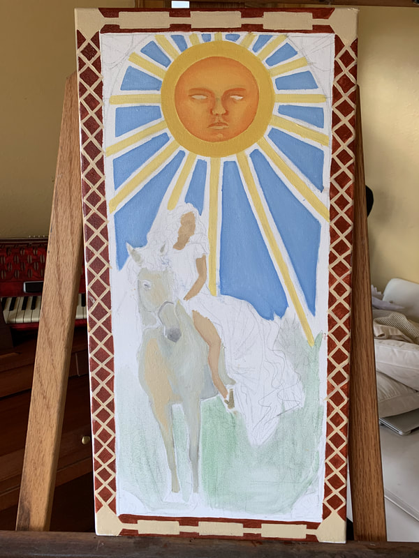
Here, I began working on the girl and the horse. I put down a dark gray over the horse first, and a tan color for her skin. I then began building up layers of lighter colors, blending when needed. I also made a gradient of green for the background using a larger brush. This made the horse and girl stand out better, and the white parts stood out better. Once that was dry, I added on the decorative leaves and border. At that point, it was looking more complete. All that was left was a few finishing touches and some intricate border designs to tie it back to Mucha.
Second Stages (added color and added detail)
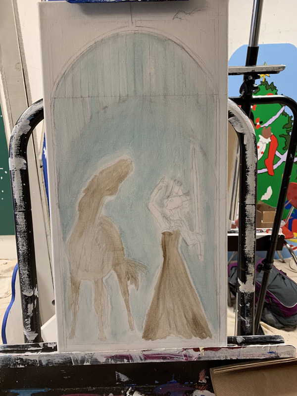
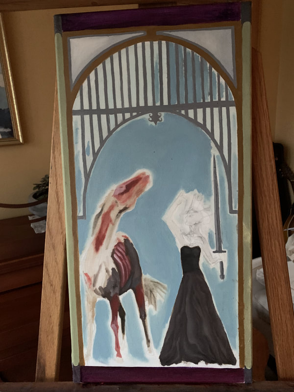
With that painting done, it was time to move onto the next one. I repeated the process as I did with the first, making a wash that laid out the basic colors of the piece. I then went in to try and mix the colors for my background. I wanted grayish greens, blueish gray, and, well, more gray to help bring down the piece. The cool colors were supposed to invoke a dismal, cold feeling. However, the paints didn't turn the hues I wanted to, and I was forced to leave it alone until later. Next, I painted a tawny coppery color for another border. This was something I had to repeatedly do throughout both peices and was a source of struggle for me. I found it hard to keep my hand steady as I dragged the brush along the canvas. I made a lot of mistakes, putting too much pressure at some points and making the line too wide. This forced me, depending on where in the peice it was, to either make the whole borderline bigger or to leave it to paint over at a later time. I wish I had the control necessary to paint straight, clean lines, but I did the best that I could. The next thing I did was move to the focus of the painting, putting on browns and black on the woman's long dress. Using the process I came across in my experimentation, I painted parts of her dress. I began with adding some basic blocks of color where the darker and lighter areas of the skirt were, then swirled the edges together with my brush. Generally starting dark and worked my way up, I eventually added in more light and blending shades together. It was here that I really regretted not using grid method, as I couldn't translate the folds of her dress to my canvas super accurately, and had to simply go off intuition and a basic guideline.
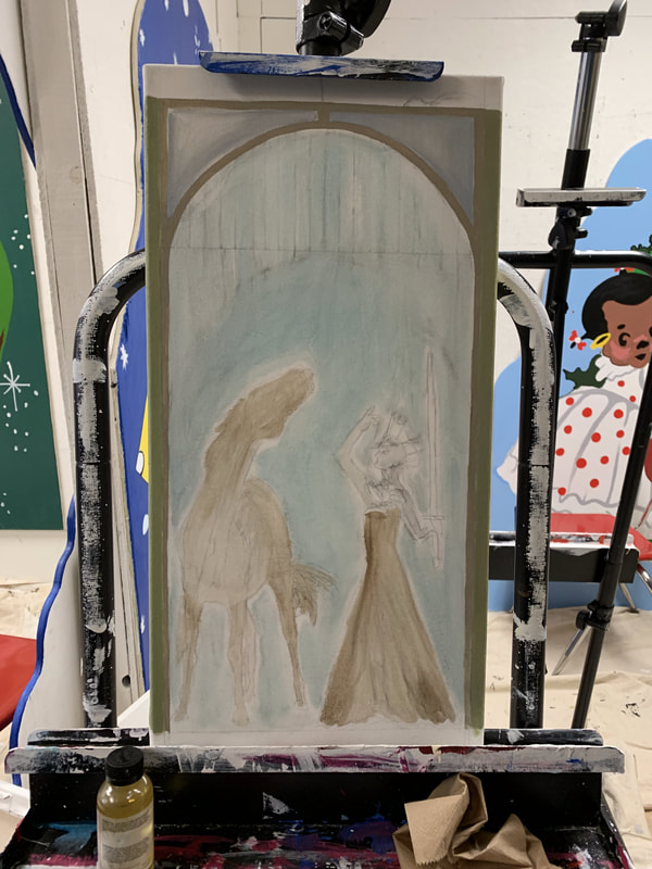
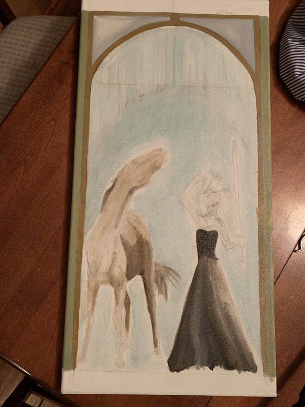
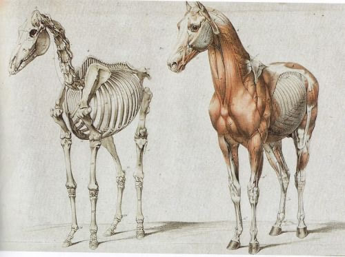
Next, I moved over to the horse for a little, beginning the Francis Bacon-esque features of exposed muscle and bone. Already, I enjoyed it far more than the first, mostly due to its macabre nature (which I tend to gravitate towards). Similar in how I painted the white horse, I began with darker shades and mixed in brighter lights as continued. At this point, I felt that this work was a little bland, and that it needed more changes in color and textures. So, I added a darker blue for the background and eventually even darker blues and a purple at the base to develop a similar gradient to the first painting. I also continued to fill in other areas of the painting, such as the purple and gray on the border and an olive-green at the base. I added the vines and metal gates, as Once I felt that had more or less dried, I went over the whole thing with final, small details to bring it all together.
|
|
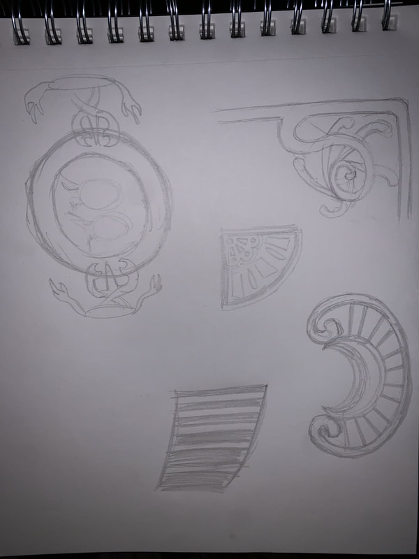
These final details included the distinctive patterns that made up the Mucha and Art Nouveau style, similar to the ones I experimented with earlier on in the planning stage, which resembled some scroll-like shapes, crossing lines of green-gold, and silvery spheres. I tried to keep the color scheme on the cooler, metallic side in order to keep a theme throughout the artwork. With that, my second piece was done.
|
|
|
|
Similarities: Both my work and that of Alphonse Mucha had a similar subject matter. Both of us used women as primary subjects for our work in order to display feminine beauty. We also both incorporated plant matter into the pieces and used borders to give the work a flat, graphic quality. I also, like him, had multiple layers that were separate from each other.
Differences: Physically speaking, there are certain elements that make a difference between my work and my primary influence, Alphonse Mucha. Art Nouveau is characterized by asymmetrical lines that are created through the use of plant material, objects, or blocks of color (some of which transcend 3-D forms) that serve to establish a unique decorative effect. in my pieces, I had very little lines that outright crossed between layers. In this, I lacked in some of the distinctive aspects of Art Nouveau and Mucha. There were more elements in his pieces, making them more complicated, whereas I had less, and they weren't as connected. |