IN PROGRESS!!!
*Trigger Warning: Contains Mentions of Gun Violence and Child Death*
Digital Art: Indistinguishable

|
Title: Indistinguishable
Medium: Digital Art and Photo Manipulation Size: Date: September 2022 |
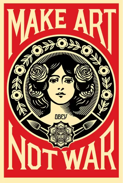
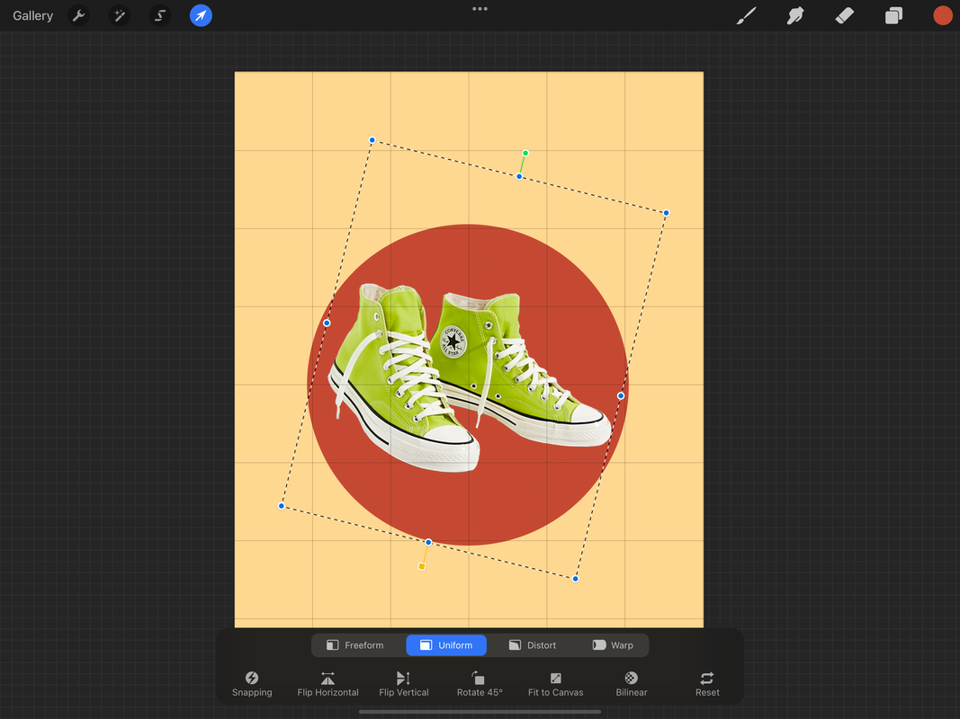
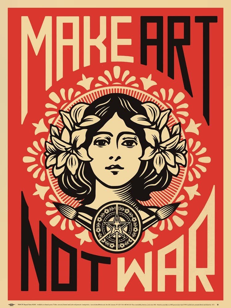
Indistinguishable is a digital manipulation of photos and drawn elements on Procreate and was inspired by Make Art Not War by Shepard Fairey; a spin-off of the anti-war phrase, "Make Love, Not War" that began in the sixties. The particular poster was created in protest of the war against Iraq. I have one of their posters in my bedroom, and I recently rediscovered some of the signs I had used in the MarchForOurLives campaign that followed the Parkland shootings.
|
|
This print, created during the Iraq war, is an alternative phrase inspired by popular 1960s anti-war mantra, “Make love, not war.” In the work, Fairey calls for creative instead of destructive acts. The Art Nouveau style of the print is an additional reference to the influence of Art Nouveau on hippie and psychedelic art of the ‘60s, including a large amount of anti-Vietnam war posters. Encased within a floral garland, the female figure appears more self-assured and real rather than ethereal and dainty, as some women are depicted in art. The placement of two paintbrushes below her portrait not only refers to a classical tool of art production, but can also resemble spears. When read alongside the directive to “OBEY” that appears on her neck, the message is even clearer. The simplistic color pallet serve to not distract from the images, while also adding emphasis to the center figure and bold emotions. The symbol is easily recognized, with a dynamic, symmetrical design and balanced in composition. The modern spin is good because the message is still relevant to this day. It is normal for the creator, American contemporary artist Shepard Fairey, to create works in this style. As an artist, activist, and founder of OBEY clothing, he typically finds himself working in street art, designing posters, stickers, clothing, and more. In fact, it was he who created the iconic "Hope" campaign poster for Barack Obama.

Fairey's work consists of heavy political and social commentary, with reoccurring themes of propaganda and modern movements such as Occupy Wall Street, Black Lives Matter, and the Women's March.
My first exposure to this piece was years ago when it was first released. If I am remembering correctly, there was a post about it by Bored Panda, which my dad showed me. He enjoyed the print as well, and purchased it. I have since moved it to my bedroom. Soon after school started, I came across old posters that I had used in the marches calling for gun reform after the 2018 shooting at Marjory Stoneman Douglas High School in Parkland, Florida. 17 people, most just a few years older than me at the time, were killed in an act of violence as a former student enacted his horrific revenge fantasy with an AR-15; a semi-automatic rifle used in multiple mass shootings, including Sandy Hook, and now, Uvlade.
Maite Rodriguez
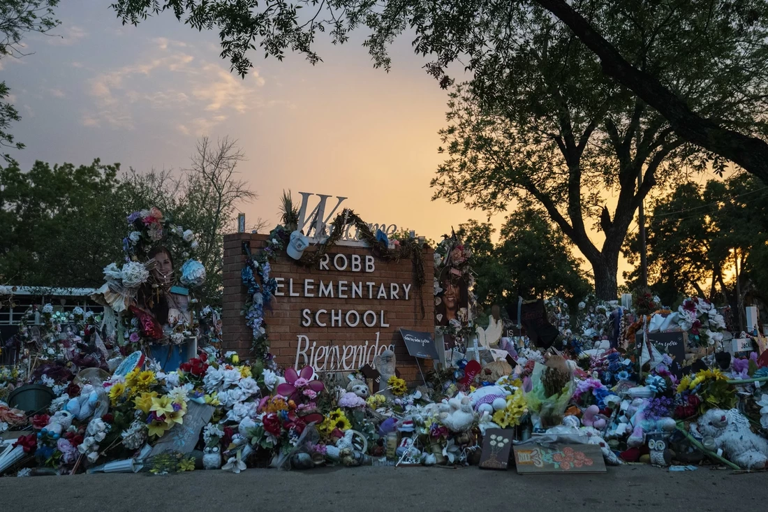
I first saw her name while scrolling through my news feed when I came across an article deter;omg how Matthew McConaughey spoke up at a white house briefing, pleading for stronger gun laws in the days following the shooting in Uvalde, Texas, which left 19 students and 2 teachers dead at Robb Elementary School. In his hands, he held a pair of green converse; a similar pair to the ones 10-year old Maite Rodriguez was wearing. The size five shoes with a heart drawn on the toe was the only way that her body was able to be identified. She had been shot in the face. The following is an except from CBS:
|

|
|
"Maite found the sneakers while the two were out shopping, something her mom said was turning into a new activity they would bond through.
'We were at a local shoe store here and she wanted Converse," Rodriguez recalled. "She saw at the bottom shelf these lime green Converse and they were on sale, so she said, 'Look mama, look at these shoes. I found Converse,' and I said, 'Well let's see if they're your size,' and they were her size. They were her exact size.' Two days later, Rodriguez said she saw her daughter sporting a freshly drawn heart on the toe. 'I said "Maite, why did you draw a heart on your shoes? I just got those for you," and she goes, "Just because I really like them,"' she said. The heart, Rodriguez feels, is a testament to Maite's sweet nature. 'She was just an all-around sweet girl. My sweet girl, that's what I called her – my sweet girl,' Rodriguez said. 'She was smart, beautiful and best-of-all she was my best friend, and I don't exaggerate on that. She was my best friend. We went everywhere together.' Together they planned to visit Texas A&M University-Corpus Christi, Maite's dream school where she hoped to become a marine biologist. 'It started in kindergarten. She couldn't even say marine biologist yet… I thought with time she's going to change her mind; she's going to want to be a nurse or something when she gets older. Well, she never changed her mind,' Rodriguez said. 'I wanted to keep encouraging her, you know, maybe if she saw the college or the university, the ocean – it would just keep driving her even harder.'" Her obituary stated; Maite was a sweet girl and those who know and loved her were blessed with her kind, ambitious, friendly and sweet soul. She was an AB honor student who enjoyed learning about animals and the ocean; especially dolphins, whales, and dogs. She dreamt of attending The University of Texas A&M in Corpus Christi to become a Marine Biologist because of her caring heart towards wildlife and the animals within it. |
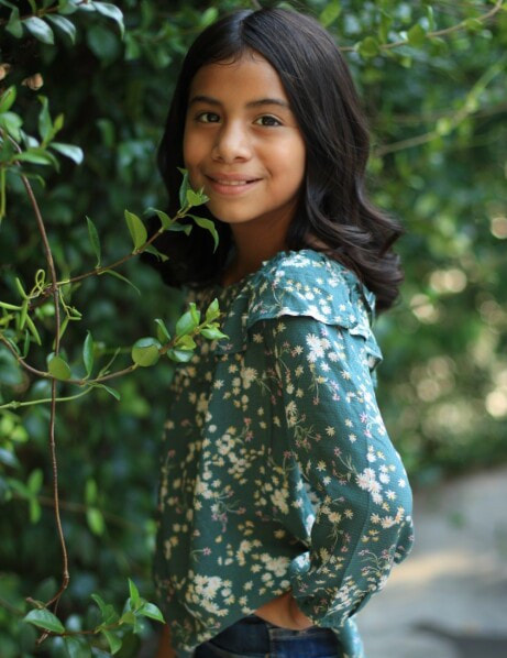
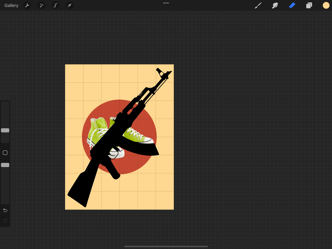
She wore the green high-tops with a heart because they represented her love of all things nature. When getting them, she had no idea it would be her family's only source of identification, or that it would become a massive symbol following her death. The memory of her sweetness, her ambition, and her dreams helped to spur on more calls for action. Her simple sneakers are a reminder of her humanity and personhood-that she loved the color green, shopping with her mom, watching Attack on Titan, jalapeños on her burgers, gym class, and getting good grades. It's a heavy reminder of all the life she had left to live before it was stolen away from her. Gun control has been called for again and again, with little-to-no change due to the sponsorship of gun lobbyists and supporters of politicians.
|
|
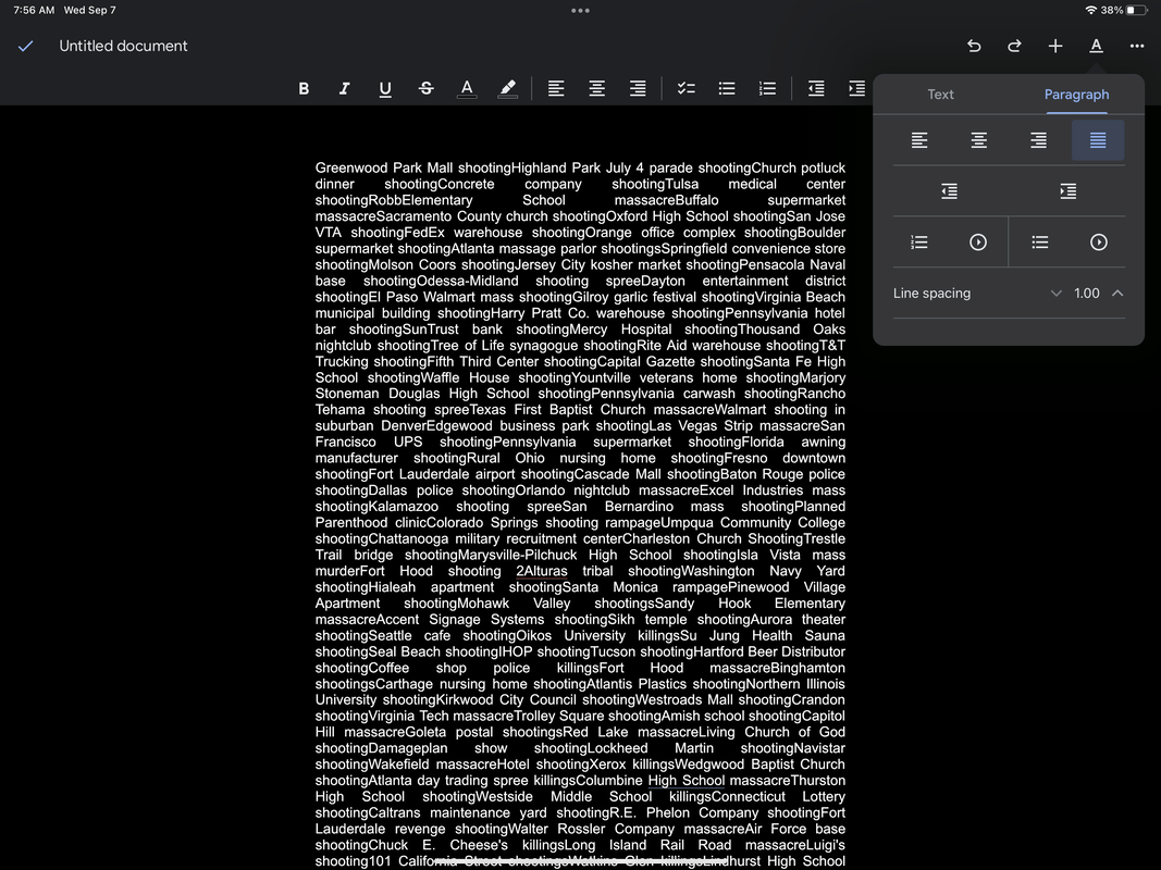
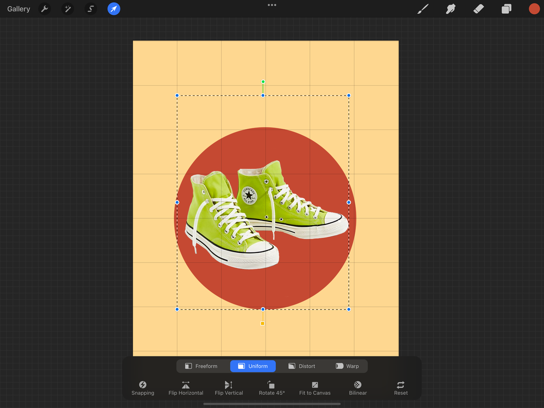
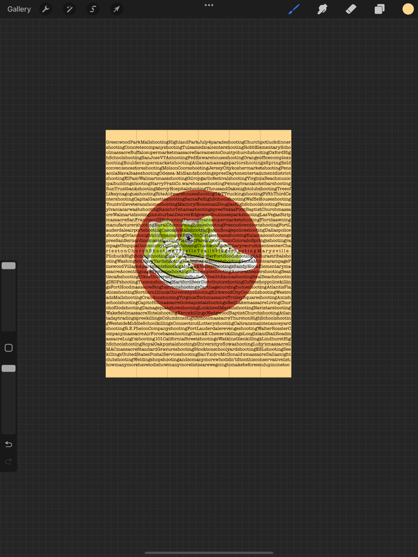
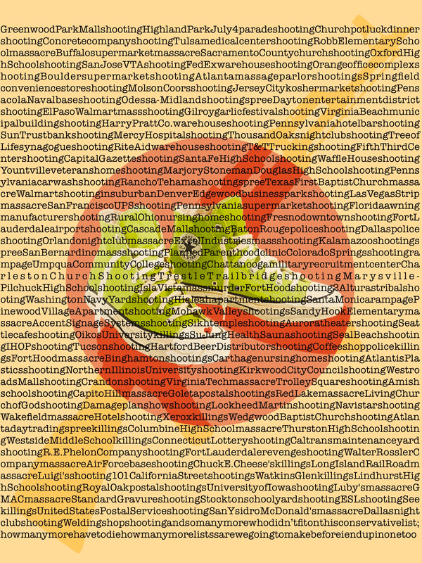
I scoured the internet for photos, typing in "lime green high top Converse" and AR-15 silhouette. I felt that having a fully detailed gun, along with that of the shoes, would lead to a jumbling piece with difficultly discerning what was what. The green shoes, however, were more vital to distinguish, so I left those alone. Finally, after gathering my two images, I went to google and searches for the number of mass shootings in the United States. What I found was an astronomical number: there was no way I could fit it all into one paper. I did find one article describing their model and standards for what they were considering a deadly mass shooting. This more conservative list came from Mother Jones, which still had a large list, but was more manageable to work with. I copied the spreadsheet into a google document and deleted the spacing between lines and words. I then altered the font to a typewriter typeface, so it would resemble that of a newspaper with breaking news. I also chose a vertical poster, similar to that of a book page, as I felt it would be easier to read the overlaying text if the formatting was similar.
|
Once that was ready, I went back to Procreate, applied a background color, inserted the images onto different layers, and erased the backgrounds of the images so it was just the figure itself. I used the color grabber to find the shade of the shoes, then used the color wheel in Procreate to find complimentary, secondary, analogous, and tertiary color pairings. This helped with the color theory in the work and made it more visually pleasing.

|
|
|