There's Something in the Pool

|
Title: There's Something in the Pool
Materials: Linoleum plate, buffer, ink, carving tools, wood block, Date: September 2021 Size: 29 x 23 cm |
Exhibition Text
“There’s Something in the Pool” is an ink print meant to portray a modern spin on ancient mermaid myth. The use of line and texture helps give the piece movement and a sense of direction towards the sinister creature lurking in the corner. This piece was inspired by the works of John William Waterhouse. |
|
Inspiration
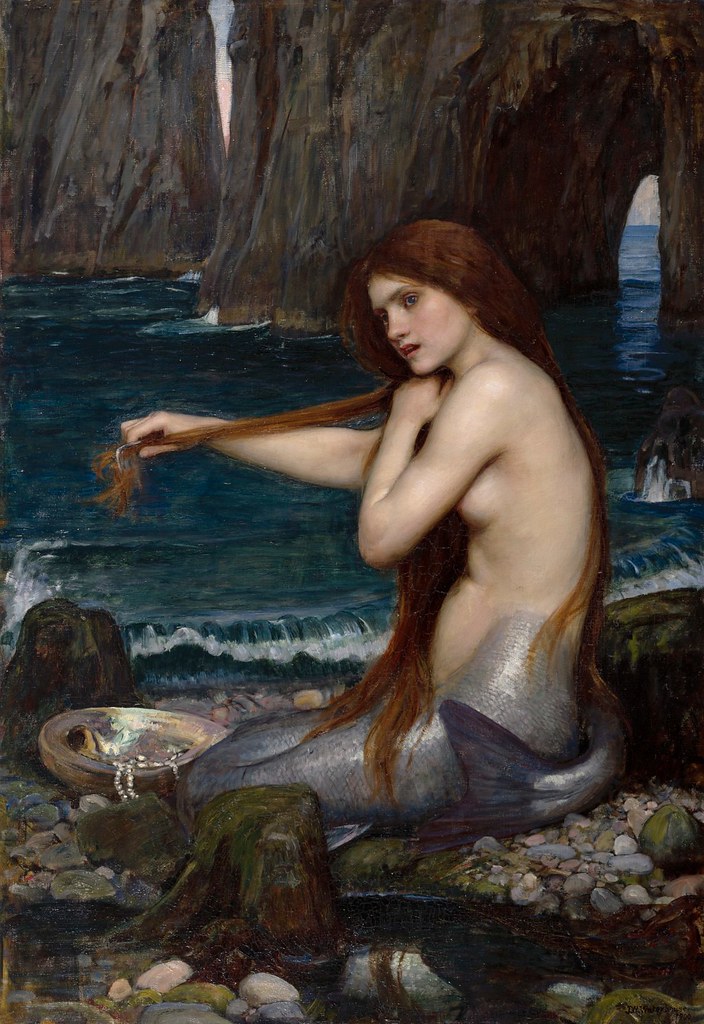
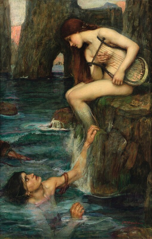
"There's Something in the Pool" was inspired by John William Waterhouse's "A Mermaid" (1900) and "The Siren" (1900). Waterhouse was a Victorian-era painter most known for his large paintings of classical mythological subjects. He held a great interest in literary studies and was inspired by famous writers like William Shakespeare and Homer. Years after his death, his brushy, sketchy style of painting became an inspiration for contemporary and Impressionist artists. Many of his paintings depict dramatically-posed, beautiful women. Much of his artwork depicted figures from ancient Greek Mythology and Arthurian legend. At the time, artists made paintings and sculptures that took the viewer into new worlds, far away from the harsh realities of life and poverty (mostly brought on by the Industrial Revolution in England specifically). Waterhouse's use of strong feminine figures based off of ancient tales and legends were part of his Pre-Raphaelite work. He also combines realism and classical art styles. The examples I took specific inspiration from were "A Naiad" (1893), "A Mermaid" (1900), and "The Siren" (1900). These three paintings are all based off of mythical marine women. All three of them look elegant and poised, which I wanted to incorporate into my piece. And yet, through their beauty, there are also elements of danger, magic, and power. In the piece "The Siren", his inspiration came from the Siren stories. They were beautiful women in the sea that would lure sailors to their deaths, hiding their true nature until it was too late. I have seen the painting,"A Mermaid" reoccurring throughout my art education through the years, and for some reason it always comes to my mind when I think of mermaids. I decided to look into more work by the artist and came across his other works. I could instantly see the similarities and the distinct characteristics of Waterhouse's paintings. When looking at "A Mermaid", the eye is immediately drawn to her, traveling down her body to her tail and then the little treasures around her. Waterhouse made these paintings in order to express his appreciation for the powerful beings of history, fueling his imagination and creating a portal to another world for himself and viewers of his artwork. I myself love drawing creatures of fantasy, both familiar figures from myth and those from my own mind. Finding an artist that seems to have the same passion for drawing outside of reality is one I feel I can connect to, which is a major reason why I chose John William Waterhouse as my inspiration. |
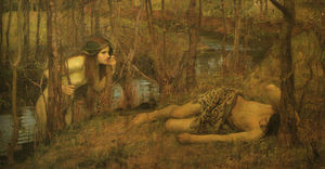
"A Naiad" John William Waterhouse (1893)
|
|
Planning
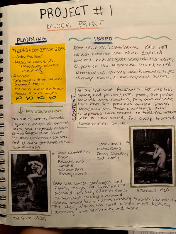
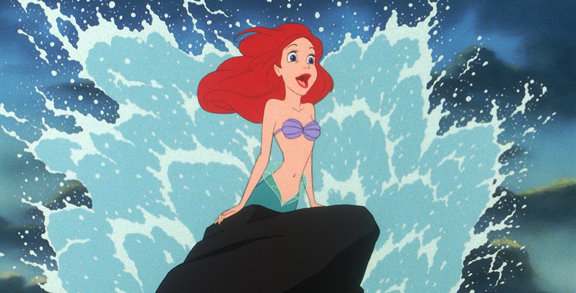
The first thing that I did was research the lore and different versions of mermaid myths. Through different cultures there are similar beings, though many are portrayed differently. Some are stunning creatures that simply graced people with their beauty, while others hide hideous faces and sinister intentions. At first, I was torn between doing one or the other, and settled on something similar to "A Mermaid", with her sitting peacefully on a large rock. However, another side of me wanted to continue with more eerie elements, as I have always found the ocean to be a balance of beauty and fear. I created a fewI wanted to incorporate both into my piece, combining them into a dual-personality. I thought about how I could incorporate traditionally human traits that could be deemed attractive and the more animalistic, scary side. I also connected it to things already in my life-such as childhood films and other ideas I've had throughout the years. then used a set of watercolor paints to draw out different types of scales I could use for the mermaid's tail. Then, I connected my project to my past through the movie, "The Little Mermaid", using the character of Ariel as additional inspiration. The Disney version of Ariel is considered a "good character", and I wanted to have a mix of more modern characters to draw inspiration from. Continuing with the idea of characters from movies, I returned to Dreamworks' Sinbad: Legend of the Seven Seas and the sirens that entrance and seduce the characters onboard a ship, almost ending the journey early (not shown in photos of journal) The last part of my planning was drawing out sketches. I drew a few different mermaids, each with slightly different looks so I could figure out what I thought fit best. I decided on my third and final design in the end. To the right is a photo of some of my research, as well as photo's of the art that inspired me. I made sure to include some of my intentions early on and my loose ideas. |
Sirens from Sinbad: Legend of the Seven Seas (2003)
|
Experimentation
|
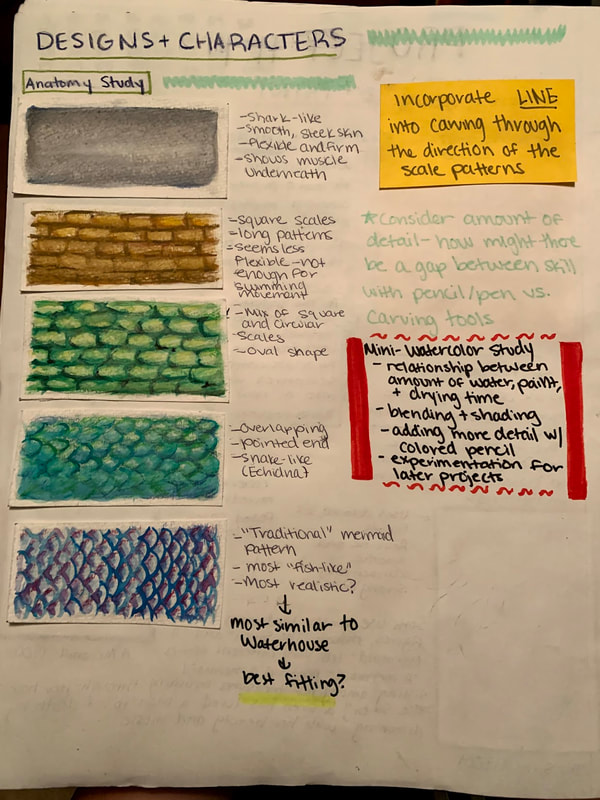
The first part of my experimentation was the texture of the scales on the mermaid's tail (as shown on the right). I decided to practice using watercolor, further broadening my overall skills. I took inspiration from various animals, including sharks, snakes, and most importantly, fish (which I finally settled on, as it was the most realistic and fitting in my opinion). After evaluating and choosing a pattern I might like to stick to (I was also attracted to the shark design), I started thinking about how I could incorporate textures into my piece. One thing I tried to keep in mind as I was planning was how using carving tools and a rubber plate might not translate details I could otherwise make with a pen or pencil.
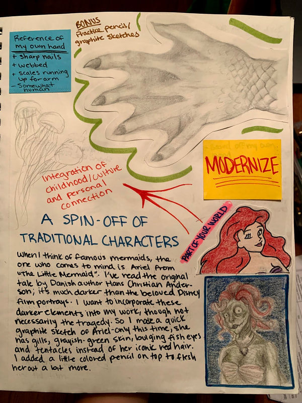
When I think of mermaids, my mind often goes to the infamous tale of "The Little Mermaid". I grew up watching the Disney film and a couple of years ago I read the original by Danish author Hans Christian Anderson. The original, like so many other fairy tales, is significantly darker than that of the children's movie. I wanted to incorporate both the familiarity of the beloved character and the darker elements of her story. In this, I created a quick graphite sketch of an alternate Ariel character, this time with bulging eyes, an angular face, flared gills, grayish-green skin, and tentacles instead of her iconic red hair. Afterwards, I decided to color it in order to flesh out her character a bit more. SINBAD |
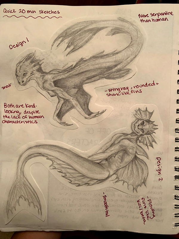
The final part of my experimentation was full-body mermaid designs. The two to the right both have very few human characteristics, with heavier fish/aquatic features. They are a bit far from the traditional mermaid, like the ones depicted by Waterhouse (feminine body on top, fish tail instead of legs). I used graphite pencil, timing myself to ensure I didn't go too overboard on a sketch and limiting the time to one hour.
|
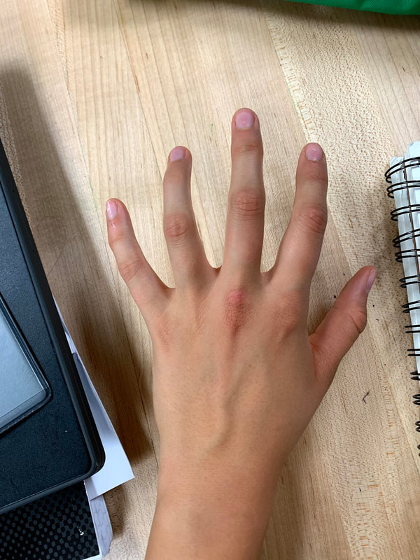
Next, I used my own hand as a reference to make a realistic version of a mermaid's hand, which is shown in the process journal page below. This was part of my experimentation of combining human attributes to the animalistic, creature-side of my characters. The point was to take away human aspects, but not all of them, bringing the characters into the uncanny valley. They're human-like, but something is off-which should unsettle us. That was the goal I had in mind. I added scales up the forearm, sharp claws and webbing between the fingers. I also slightly changed the composition/anatomical structure of the hand to make it seem slightly off.
|
Process
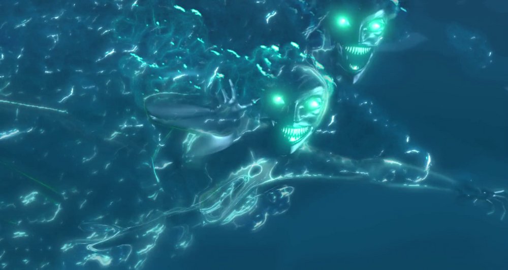
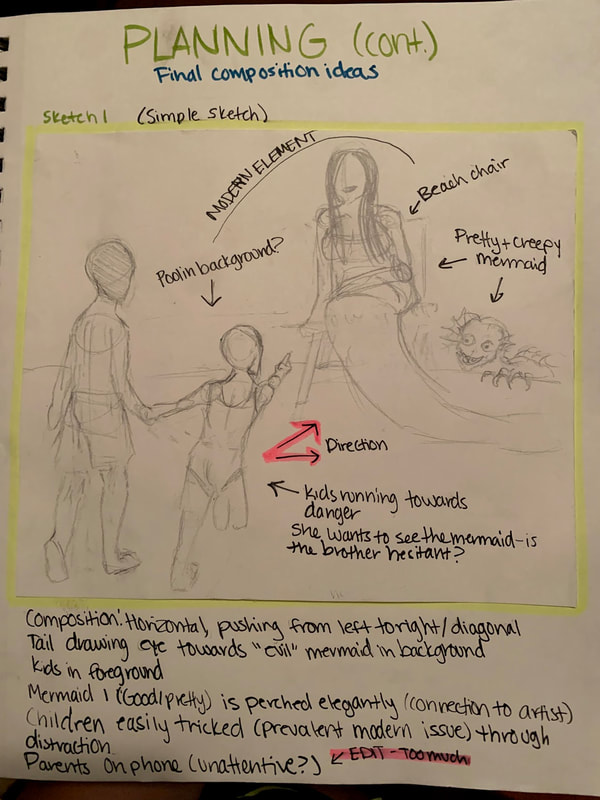
The first step in my process was to draw out my final sketches. The first that I created (left) was very basic in design. It was essential additional experimentation and weeding out some of the ideas that had been floating around in my head. In the first sketch, I considered adding parents who weren't paying attention, but ultimately decided it would be too busy to add more subjects into the piece. I wish I could find another way to imply it-parents being distracted by their phones or social media and not paying attention to their kids with possible dangers around is something I see on the daily, but I just couldn't think of a way to include that. In any case, two kids, an older brother and younger sister, are walking towards a beautiful mermaid they see by the side of the pool. What they don't notice is that there is a second mermaid lurking in the shadows, ready to strike.
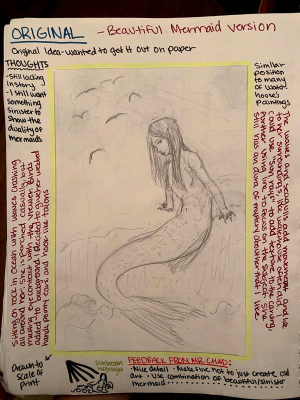
The second sketch that I made was based off of my original ideas for the project, in which I was going to make a portrait of a mermaid in the ocean. However, while the design itself didn't have anything wrong with it, I felt it was somewhat lacking in substance and story, and it was too similar to that of Waterhouse's. It's re-creating old art, which is something I want to learn to avoid. I don't want to recreate anything, but instead develop my own ideas and concepts. Furthermore, I still wanted to add the sinister element of mermaid myth into my piece, so I decided to abandon the second design.
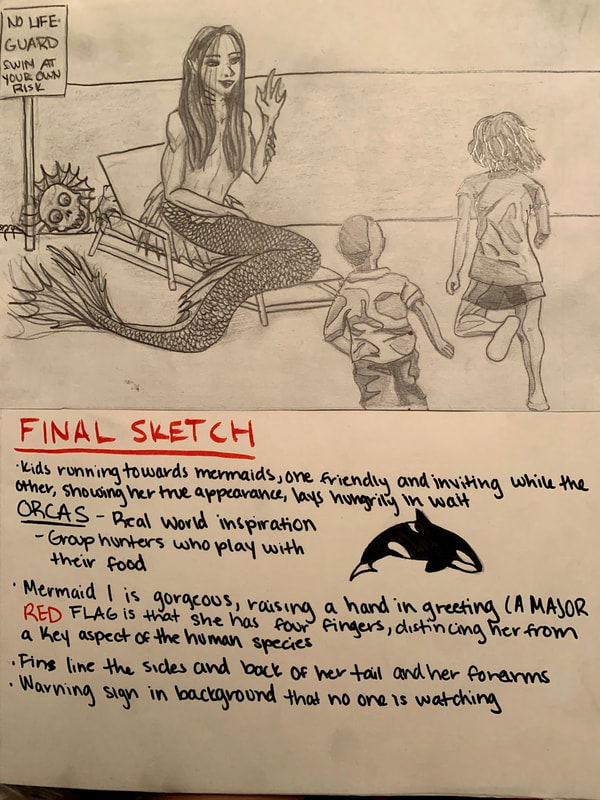
The third and final sketch is the one I eventually copied onto the print. I changed the direction of the kids, but kept some of the anonymous elements by having them face away from the viewer. This gives the viewer, then, a full view of the scary mermaid's face and sharp teeth. I also added a sign behind, reading. "No Life Guard: Swim At Your Own Risk" in order to replace the idea of the parents not watching. I wanted to convey feelings of danger, suspense, since the viewer knows what is going to happen but cannot do anything to stop it. I also connected it to actual marine life in how orcas (Killer Whales) hunt together. They surround their prey, trap them, and often play with them for their own amusement before eating them. I added fins along her spine, sides, and forearms, and gave her only four fingers in order to reach that subtly inhuman aspect of even her most familiar features. I used a block-like shading, knowing I couldn't easily make smooth details on the actual print.
The second sketch that I made was based off of my original ideas for the project, in which I was going to make a portrait of a mermaid in the ocean. However, while the design itself didn't have anything wrong with it, I felt it was somewhat lacking in substance and story, and it was too similar to that of Waterhouse's. It's re-creating old art, which is something I want to learn to avoid. I don't want to recreate anything, but instead develop my own ideas and concepts. Furthermore, I still wanted to add the sinister element of mermaid myth into my piece, so I decided to abandon the second design.
The third and final sketch is the one I eventually copied onto the print. I changed the direction of the kids, but kept some of the anonymous elements by having them face away from the viewer. This gives the viewer, then, a full view of the scary mermaid's face and sharp teeth. I also added a sign behind, reading. "No Life Guard: Swim At Your Own Risk" in order to replace the idea of the parents not watching. I wanted to convey feelings of danger, suspense, since the viewer knows what is going to happen but cannot do anything to stop it. I also connected it to actual marine life in how orcas (Killer Whales) hunt together. They surround their prey, trap them, and often play with them for their own amusement before eating them. I added fins along her spine, sides, and forearms, and gave her only four fingers in order to reach that subtly inhuman aspect of even her most familiar features. I used a block-like shading, knowing I couldn't easily make smooth details on the actual print.
|
|
|
The next step in my process was to copy the design onto the plate via transferring. Once that was completed, I added any details I had missed and prepared myself for the carving process. Firstly, I carved out the top of the piece for the sky, making it completely white. I decided early on to keep the water completely black in order to add themes of the unknown about what is in the water. In a dark pool where you can't see what's inside...I know I wouldn't swim in it as a kid. I then began to carve more out of the bottom section. My intention was to make the piece darker in color in order to bring down the mood, since lighter, brighter pieces tend to have happier subject matter. I carved out more and more, showing highlights and outlines of the figures. I found the process more difficult than I anticipated, but it got easier as I got used to the material over time. The print had gotten quite dirty during the transferring process, which was annoying as it kept making messes. The next step in my process was to add fine details, such as the fines, scales, hair, face, and final shading of the kids and mermaids. Once I had carved out an amount I felt satisfactory, I made a test print to see if the indented areas were deep enough and to see how the final product might end up looking.


|


|


|
The next step in my process was to make edits to the print. I washed off my plate and supplies, then got the carving tools back out and began making adjustments. The top needed to be deeper, the highlights and shadows on the children in higher contrast. Furthermore, the lines on the scary mermaid needed to be deeper and thicker. I also had avoided carving the scales due to the amount of small detail work required, but upon seeing the test I felt I needed to add them. I went back over the piece, making necessary adjustments. Once I felt I had covered all the areas that needed change or going-over, I tested the print again. I was still unsatisfied with some of the details-many were blurry or hard to make out. In some areas, I had carved too much and had distorted the figures. At this point, there was very little that I could do that could salvage the mold, save for scraping the thing entirely and starting the carving process over again. However, at that point, it was the last possible day to use the printing materials before it was due, and so I had to push through.

|

|

|
Critique And Reflection
In my opinion, some of the mistakes that I made were that the words were backwards, the details were distorted/unclear, and it wasn't in the standard block-print style. Attempts to use negative and positive space were unsuccessful. Not happy with the way it turned out and overall frustrated with the finished product. The new type of media was unfamiliar and I had to learn how to use it as I went, which led to some mishaps and mistakes I was unable to fix. I liked the concept and story line, which I think could be understood by the common viewer, but I don't like how I executed it. This is mostly because I tried to modernize a specific style of art (block prints), which didn't translate. I had also wanted the shading to be more even and consistent and aligned with that of traditional block printing art style, but I messed up early on an had to compensate. However, a major issue was that I then overcompensated, and I felt that the newer version looked worse. Furthermore, upon reflecting, I felt that it lacked in connecting to my inspiration. While there were mermaids in the piece, they didn't reflect the style of John William Waterhouse in how they are painted gracefully and naturally. I do think that I captured the idea of bringing old myths and stories into the world, plus the added twist of modernization. But I do not think that my technique (shading, use of negative/positive values, layout/placement, or detail) was able to add emotive elements to the piece like I had hoped, and my attempts to emphasize subjects ended up looking messy and chaotic. One area was the mermaid's tail, meant to help draw the viewer's attention to the hidden mermaid. The intention was there, but the follow through just didn't work the way I wanted it to, and my efforts fell flat. If I had a chance to redo it, now more comfortable with the material, I feel that I could make a much better print. I am aware that artists are never fully satisfied with their work-after all, Leonardo da Vinci kept the Mona Lisa with him until he died, always adding onto it. But I feel like this project is one that I can honestly say is poorly done and not up to my, or my class, standards. Certain areas that I would change was the use of foreground and background. In my opinion, the positioning looks slightly off. I would also adjust the values of the pool water, sky, and ground, to make it more balanced. Keeping the sky and pool solid colors were very intense and heavy. I would also use dark outlines instead of white for the figures, save for possibly the mermaid in the pool (Water is still the darkest part of the piece). I would be lighter with some of the carving, making the lines thinner and then thicker where I wanted to show areas of shadow (similar to cartoon characters). I would be more delicate and careful when making small details, such as the faces of the mermaids and scales. I would like to think of this project as more of an experiment than a final evidence, as I was not comfortable with the materials or confident enough to make something I was proud of. I feel like it would be a good idea to do more block print work on my own now that I am more familiar, as I do enjoy block print pieces as a whole. I enjoyed the mundane aspects of the carving and printing process. It gave me time to let my attention focus on it, and my mind was able to still for a bit.
In my opinion, some of the mistakes that I made were that the words were backwards, the details were distorted/unclear, and it wasn't in the standard block-print style. Attempts to use negative and positive space were unsuccessful. Not happy with the way it turned out and overall frustrated with the finished product. The new type of media was unfamiliar and I had to learn how to use it as I went, which led to some mishaps and mistakes I was unable to fix. I liked the concept and story line, which I think could be understood by the common viewer, but I don't like how I executed it. This is mostly because I tried to modernize a specific style of art (block prints), which didn't translate. I had also wanted the shading to be more even and consistent and aligned with that of traditional block printing art style, but I messed up early on an had to compensate. However, a major issue was that I then overcompensated, and I felt that the newer version looked worse. Furthermore, upon reflecting, I felt that it lacked in connecting to my inspiration. While there were mermaids in the piece, they didn't reflect the style of John William Waterhouse in how they are painted gracefully and naturally. I do think that I captured the idea of bringing old myths and stories into the world, plus the added twist of modernization. But I do not think that my technique (shading, use of negative/positive values, layout/placement, or detail) was able to add emotive elements to the piece like I had hoped, and my attempts to emphasize subjects ended up looking messy and chaotic. One area was the mermaid's tail, meant to help draw the viewer's attention to the hidden mermaid. The intention was there, but the follow through just didn't work the way I wanted it to, and my efforts fell flat. If I had a chance to redo it, now more comfortable with the material, I feel that I could make a much better print. I am aware that artists are never fully satisfied with their work-after all, Leonardo da Vinci kept the Mona Lisa with him until he died, always adding onto it. But I feel like this project is one that I can honestly say is poorly done and not up to my, or my class, standards. Certain areas that I would change was the use of foreground and background. In my opinion, the positioning looks slightly off. I would also adjust the values of the pool water, sky, and ground, to make it more balanced. Keeping the sky and pool solid colors were very intense and heavy. I would also use dark outlines instead of white for the figures, save for possibly the mermaid in the pool (Water is still the darkest part of the piece). I would be lighter with some of the carving, making the lines thinner and then thicker where I wanted to show areas of shadow (similar to cartoon characters). I would be more delicate and careful when making small details, such as the faces of the mermaids and scales. I would like to think of this project as more of an experiment than a final evidence, as I was not comfortable with the materials or confident enough to make something I was proud of. I feel like it would be a good idea to do more block print work on my own now that I am more familiar, as I do enjoy block print pieces as a whole. I enjoyed the mundane aspects of the carving and printing process. It gave me time to let my attention focus on it, and my mind was able to still for a bit.
ACT Questions
Clearly explain how you are able to identify the cause effect relationship between your inspiration and its effect on your artwork?
The way that I identified a cause and effect relationship on my artwork was through how I brought together purpose and subject matter. I found an artist with similar interests as me and used some of the same inspiration he did for his paintings.
What is the overall approach the author has regarding the topic of your inspiration?
The overall approach is that bringing to life myths and legends can bring the viewer to a new reality and add magic to our relaity, thus transporting them away from the real world. If mermaids can collect human treasures or live in a pool, who is to say that we can't find beauty and magic in our own worlds?
What kind of generalizations and conclusions have you discovered about people, ideas, culture, etc. while you researched your inspiration?
I discovered that capturing aspects of culture and human nature can be done easily through artistic expression. John William Waterhouse created an escape, as did many other artists at his time. Humans look to stories to put aside the real world, if only for a moment, and want to live in a world where things are simpler. We know the ending of the story and it has no real consequences on our own life.
What is the central idea or theme around your inspirational research?.
The central idea/theme around my inspirational research was finding something I could connect to on a personal and artistic level. John William Waterhouse and childhood movies both resonated with me and I felt I could make ties to myself as an artist and my inspiration. Waterhouse has similar inspiration for subject matter alone, with the added desire of making an escape, and the movies of my childhood helped to shape who I am.
What kind of inferences did you make while reading your research?
I made the inference that art at the time was less about sending a message as it was about creating beauty and dabbling into personal expression.
Bibliography
"A Mermaid" John William Waterhouse https://www.wikiart.org/en/john-william-waterhouse/a-mermaid-1900
"The Siren" John William Waterhouse https://www.wikiart.org/en/john-william-waterhouse/the-siren
"A Naiad" John William Waterhouse https://www.wikiart.org/en/john-william-waterhouse/the-naiad-1893
"A Mermaid" John William Waterhouse https://www.wikiart.org/en/john-william-waterhouse/a-mermaid-1900
"The Siren" John William Waterhouse https://www.wikiart.org/en/john-william-waterhouse/the-siren
"A Naiad" John William Waterhouse https://www.wikiart.org/en/john-william-waterhouse/the-naiad-1893
