IN PROGRESS!!!
Stepping Stone Portraits

|

|


|
|
|
|
|
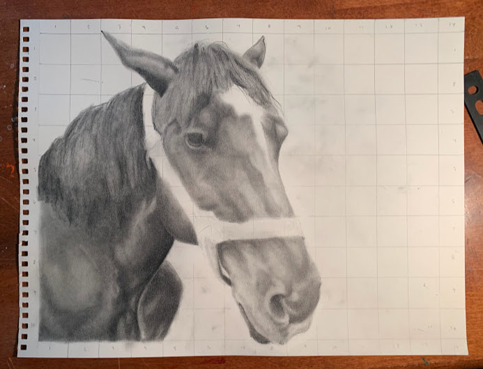
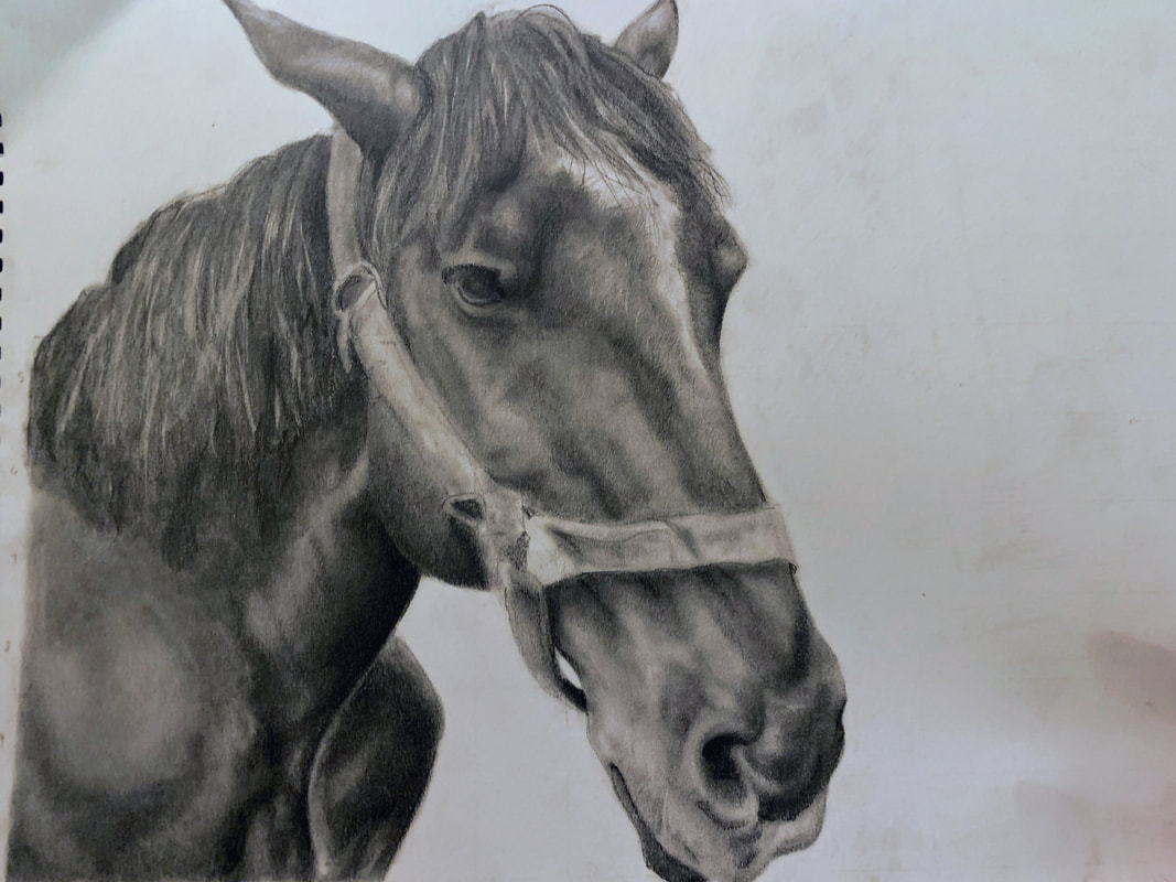
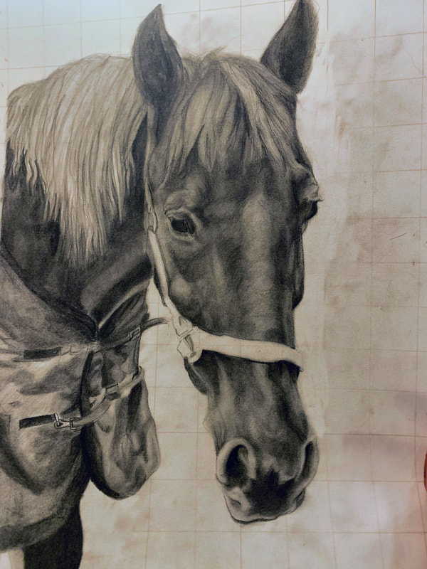
Exhibition TextTitle: Stepping Stone Portraits (John Coffey, Nina, Killian, Spike, Silver, and Dallas)
Medium: Graphite/charcoal on drawing paper Size: 11 in x 14 in Date: August 2022 |
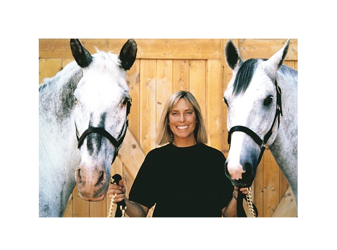
The Stepping Stone Portraits are a series of pencil and graphite-drawn portraits on drawing paper that were inspired by the work "Hara" by Deborah Butterfield in 1989. The drawings were made in order to portray some of the wonderful animals I have bonded with over the course of a few months. Much like Deborah Butterfield, my portraits are expressions of my passion for horses and a way to showcase all of their unique personalities.
|
|
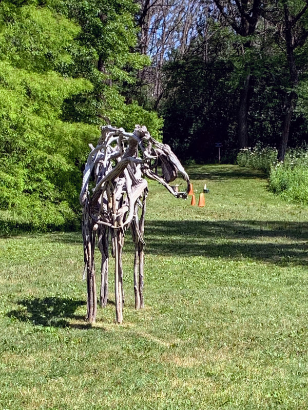
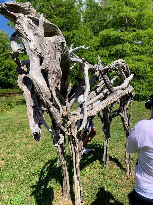
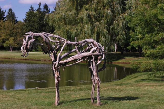
Deborah Butterfield's "Hara" was created in 1989 and is a part of the Lynden Sculpture Garden in Milwaukee. The sculpture is one of the many sculptures that reside on the property for the public to enjoy, nestled on a grassy area near a pond. From afar, it's hard to make out what it is exactly-the distance turns it into an illogical bundle of tarnished white. Upon closer inspection, it morphs into a tall-standing horse made of driftwood, but a closer look shows that it is in fact made of metal. The bronze cast was created with found objects (in this case, fallen tree branches) and molded to create the structure. When I first saw it, I though it was made of driftwood until I was almost touching it. A feel made me certain that it was, indeed, not made from driftwood. The artist uses positive and negative space, as well as gestural lines, to imply the form of the horse. There's a certain grace to the gentle slopes of the horse's neck and long legs. Combined with the natural beauty of the surrounding beauty, the horse appears to be at home in pasture, lifting it's head to peer at the approaching viewers. The 3-D form creates a sense of life and the interlocking "wood" pieces create an organic sense of movement. While the proportions are slightly off, it is obvious what the subject matter is. Texture is created by the cast bronze with the impression of wood.
|
Barbara Butterfield's work is composed of horse sculptures created from an assemblage of found objects. The subject matter stems from her love of the animals and her hatred that they were sent off to war. In the past, horses had been used in statues of generals, but she wanted to change the political narrative surrounding them. Her passion and love for horses, which she owns several of, is revealed through the gentle and empathetic emotions brought through her sculptures. By infusing the bonds she had with her own animals into her art, she hopes to create a connection between the viewer and the work as well.
|
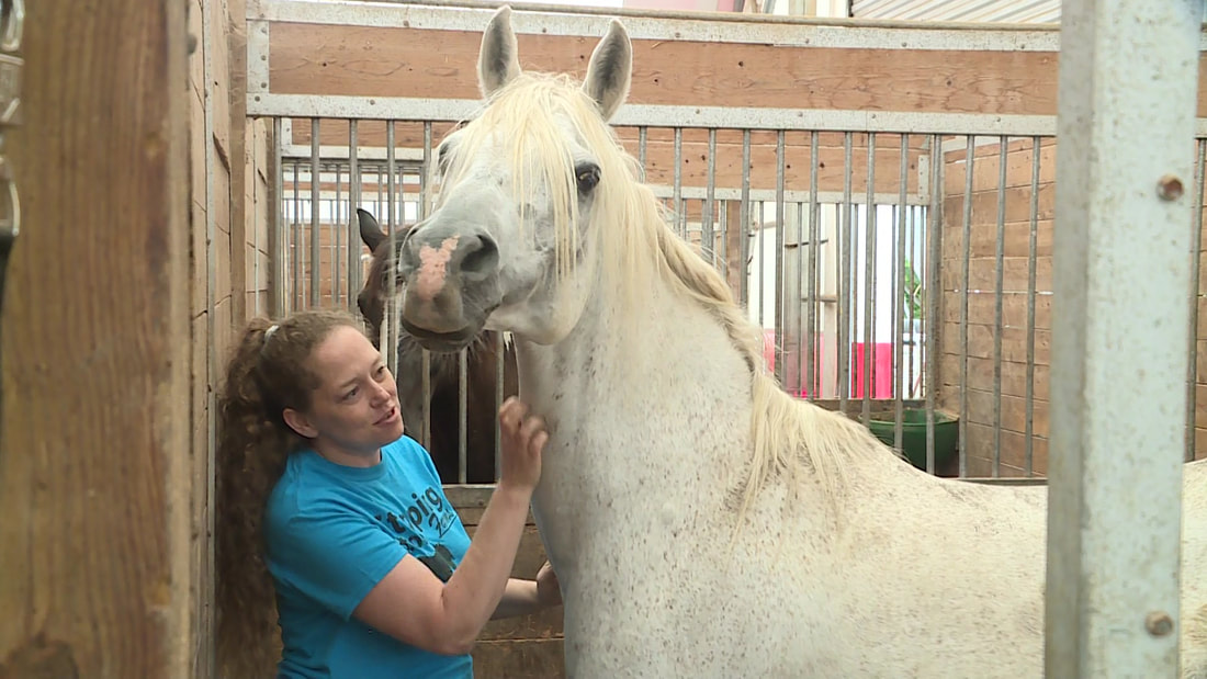
Silver and a volunteer
Nina during a lesson
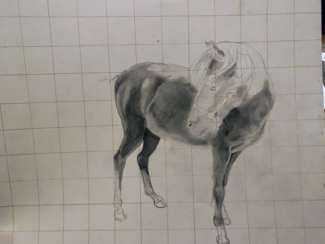
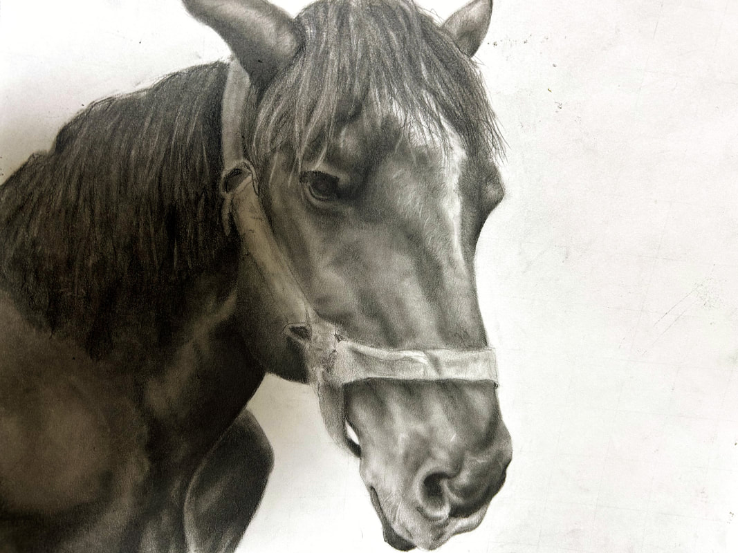
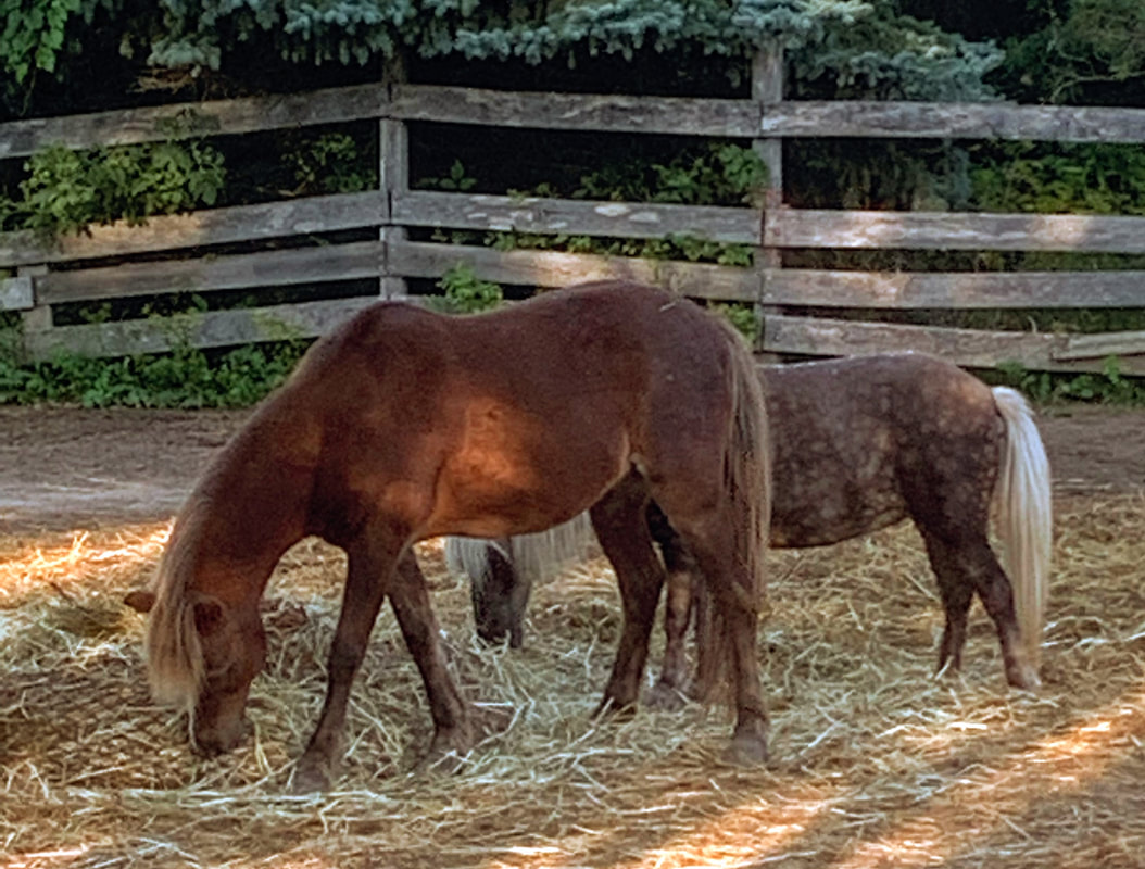
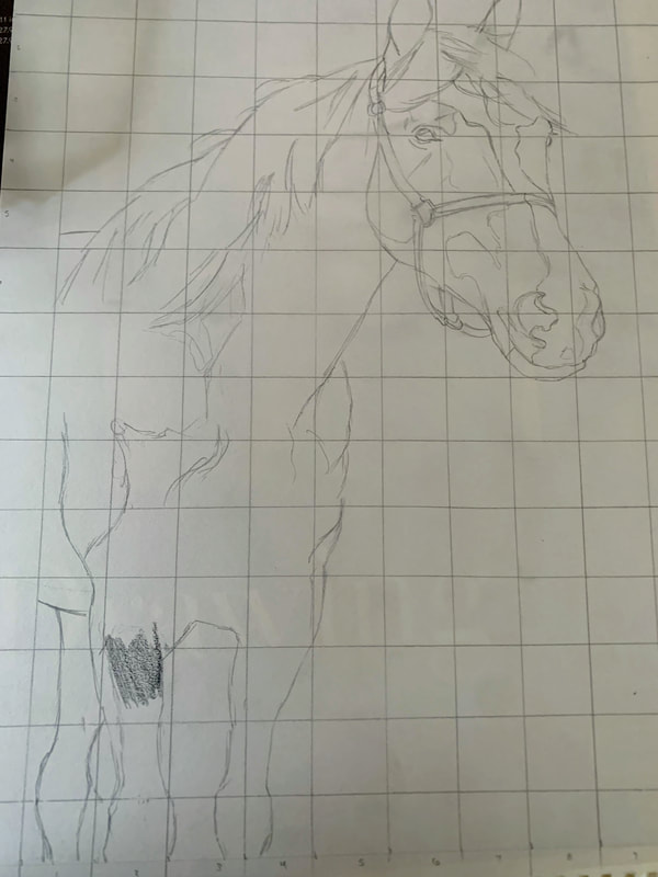
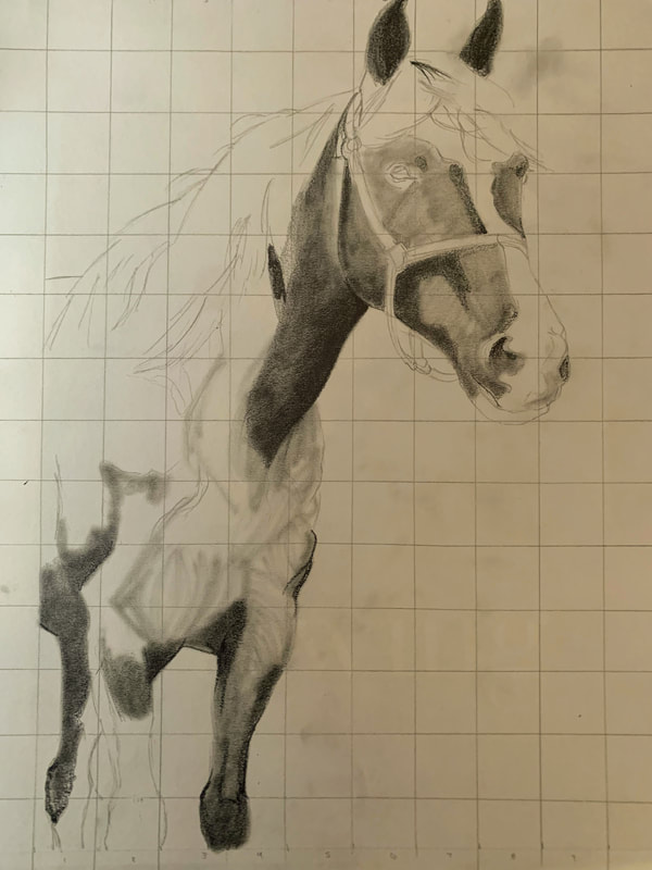
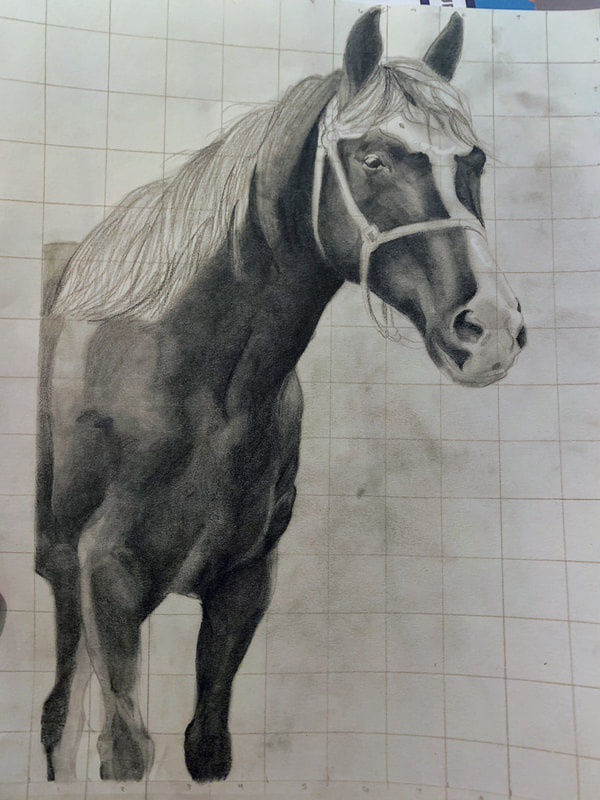
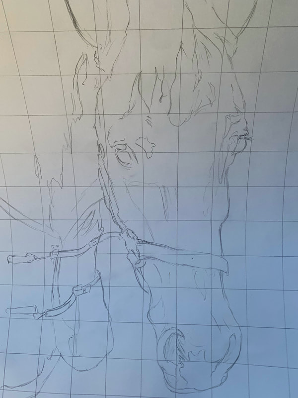
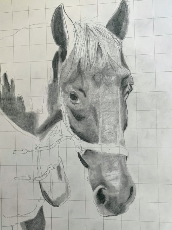
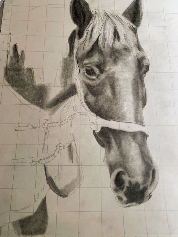
ProcessThe process for each horse was the same, beginning with a selection of photos. Due to around 99% of my shifts being in the evenings/nights, it is difficult to get a quality picture of any of the animals, as the lighting is very poor. Additionally, getting a horse in a good pose is difficult, and because the time I created these portraits was in summer, almost all of the horses had fly masks on (completely defeating the purpose of capturing their faces). So, I used photos from the farm's website, where each of their portraits and descriptions are present. Once I had picked the photos, I transferred them to black and white and digitally made a grid. I then repeated the grid onto drawing paper and followed it to create my first outline of each horse. Once that was done, I began filling in areas with pencil, starting in some of the darker areas and moving my way through the piece. All said, the process felt quite chaotic. I move around the paper sporadically, start off too light and often just repeat layers over and over again until I am satisfied. I prefer harder lead for some reason and don't like the coverage softer lead gives. Following the creation of the darkest shades, I would go back in with an eraser to make more dramatic highlights. I used light, short strokes of the pencil or eraser to create the texture of fur and the light filtering through it. Any adjustments, like making an eye too high, shadowing too far to the left, were made when I noticed them, until I felt the drawing was as close to the original image as I could get with my skill level.
|
Killian (front) and Taffy (back)
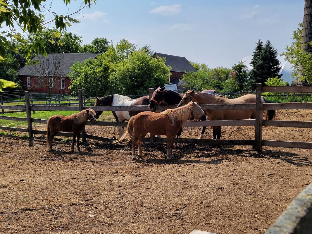
Penny (front right) , Killian (front left), Frosty (back right), Nina (back middle) and Lola (back left)
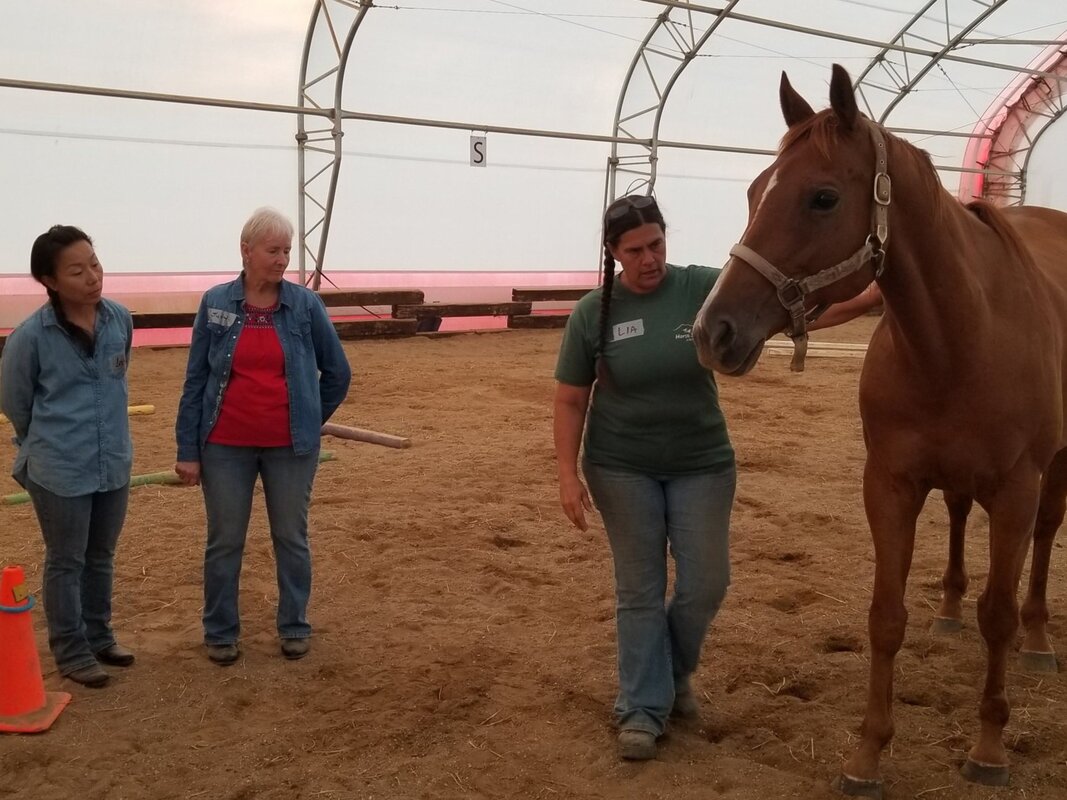
Dallas and the owner teaching groundwork.
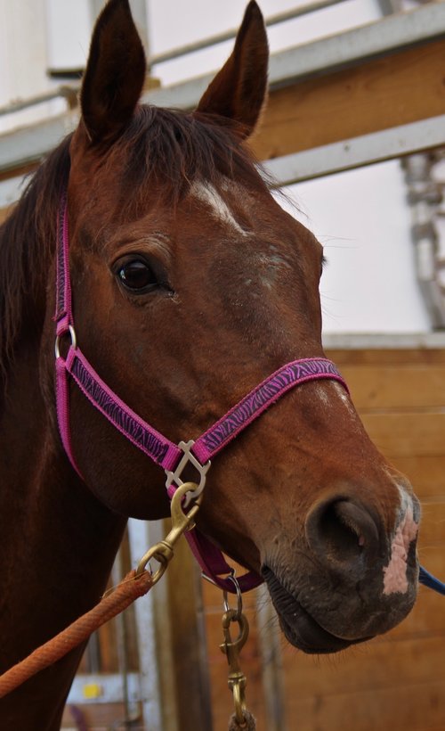
JohnJohn Coffey is a bay Clydesdale/Percheron mix who loves to stand at the gate, watch us work, and enjoys nose rubs. John is one of the first faces one is likely to see upon going to the farm. He's huge, for one, towering above the other animals with a head almost as big as my torso. He has a little white mustache on his upper lip. He's a gentle giant for sure and doesn't seem to realize how large he is. He is very sweet, and as one of the first horses I saw at the farm, I felt obligated to include him in this project.
|

|

|

|

|

|

|

|
|
|

|
|
|
|
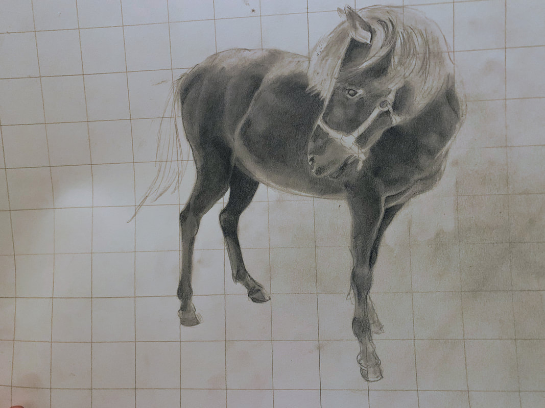
I had a bit of trouble with Killian and his proportions. Despite following the grid as best I could, it still felt wrong looking at it. Even after I had begun shading, filling him out and adding texture, I felt like the proportions between his head and hindquarters/legs were still a bit off. However, I could not find a cause for this and simply had to accept that this specific drawing would not ever sit totally right with me. I feel like not having the shadow was one of the reasons I had difficulty, as the other horses were mostly chest-up, with a large focus on their necks and heads. I feel like having aspects of the background would have definitely helped to put the subject into perspective, so it didn't look like he was just floating in space. In the end, I decided to draw some shadow. By that point, I had already erased the grid, so it was a bit difficult to make it accurate. I think that adding a darker value to the background would have helped determining the shading and outlines of Killian's body.
|
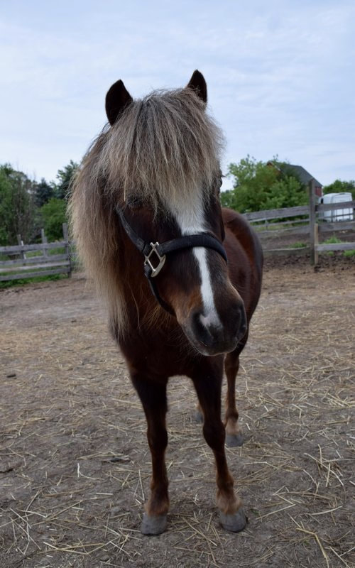
Killian Killian is a little blind chestnut pony who cocks his head to hear and loves to nuzzle and stay by your side. His story is not a sad one- he just managed to escape from a nearby farm again and again, always ending up at Stepping Stones Farm, until the older man asked the owner of the property if she would like to have him. She said yes, and he has been part of the family ever since. My goal for Killian was to capture his sweet, simple nature. He is fully blind in both eyes, but seems perfectly fine without being able to see.

|
Much like Killian, it was hard to establish and outline and the accurate values due to his lighter color. Once again, I believe that it would have been easier if there was a background color to help make those distinctions. Additionally there were many small details that required light pencil strokes and careful blending, which made it difficult. Otherwise, drawing him was the same as the other horses in terms of adding the darkest values first, then working my way randomly around the rest of him and building lots of layers.
|
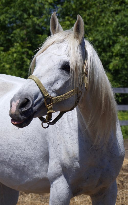
Silver was the quickest horse I drew. Silver; a gray Arabian blind in his right eye who can always be counted on for loving head scratches and giving everyone a show with his flare for drama. He is certainly stunning with his flowing mane and elegant posture. He is a favorite among many of the volunteers.


|

|
|
Spike; a chestnut gelding who loves his old friend Gemini and has healed greatly from his past, is my final drawing. Spike felt a little weird to draw. I messed up quiet a bit when trying to figure out the proportions of his face. He has a very distinctive look in his eyes, as there are patches of white around them. his gaze pulls me in, personally, and I have grown quiet attached to Spike. So much so that the other volunteers and staff have noticed the slight favoritism. At first, I had made his eye too high up, and the highlights on his nose bridge were off. Overall, If like he looked better before I continued to try and improve it, and that the extra work ended up making him look more goofy. Additionally, because I put a filter over the original image, it doesn't reflect the actual values on his face (in the original image).
|

|
|
|
|

|
|
|
I wasn't originally going to do Hank, though he was in my list of options at the beginning of the project. However, since then, some events have taken place that I feel warrant adding him to this project after it is finished. Hank, until this point, was one of my favorites. His goofy personality and his love for his best friend, a mare named Shezara, made him all the more endearing. Tall, dark, and handsome made him fast friends with all the clients and volunteers. Sadly, he passed away on a Saturday I was working. Seeing his empty stall and hearing Shezara calling out for him broke my heart, but at least he wasn't in too much pain and he enjoyed his final days happy and loved. It is expected to lose a few animals a year due to the nature of the facility. Essentially, it is a mix of a nursing home and mental hospital for horses. Many are older and sick, requiring treatment for various injuries and health issues. Still, erasing his name from the feeding/medicine charts, giving his protective-wear to other horses, and not seeing him around hurts.
Something my dad frequently does with his artistic talent is provide people with portraits of their pets who have passed on. He does this primarily with layered cardboard, colored pencil, and marker. When he delivers it, people often cry in both sadness and happiness. The immobilization of their loved one in such a caring way is a wonderful thing to witness, and I feel like I owe Hank and his owner the same. By adding him to my portraits, I can preserve his spirit and hopefully bring a bit of brightness in an otherwise depressing time. So, on my own time and outside of my IB art requirements, I will be drawing him and giving his portrait to the owner. |
In terms of the purpose and meaning of the pieces, they are very similar. Both of us have chosen horses to create art out of from our love and passion for them. Both I and Deborah have created these works as a way to express the beauty and magic of these animals whilst preserving our memories of them. While mine were modelled after specific horses I have a personal connection to, Deborah uses many different horses to help create her work.
|
Between my work and my inspiration, there are more physical differences than similarities. This is shown through the different use of materials (steel, wood, bronze, paint, etc.) and graphite pencils on paper. Her creations are much larger, heavier, and are three-dimensional, whereas my work remains relatively small and on a 2-D plane. Her sculptures are not entirely accurate in proportion or texture to the subject matter, making it abstract in nature. I focused on realism and accuracy to my references. These solid forms were made up of lines and patterns that all connected to imply the shape of a horse, which, again, is far different than my layered shading techniques to build shadow and texture.
|